Going to jump on the lacking-Doom-feels train.
While it's a huge step up from Doom 3, which was an incredible disappointment for me, it still doesn't do the original justice. In my opinion, the gameplay looks good. Nothing terribly impressive, but fun. The executions are stylistically awesome, but I also worry about repetitiveness.
My complaint is with the art direction. The original Doom games had some of the most distinct art direction of any game ever. It had so much goddamn character. The impression that you were in this place that was being slowly assimilated into a maddening hellscape was so goddamn convincing, and the demons were absolutely top notch creature design. Each was very convincingly demonic and unique, and had an instantly recognizable silhouette and color scheme.
I don't understand why they insist on trashing those incredibly creative and iconic classic designs. Update the old ones and make some new ones. Don't make something that doesn't look anything like a Cacodemon and call it a Cacodemon. It just doesn't make any sense.
And while this is again much better than Doom 3, it still suffers from what a couple others have already mentioned that seems to plague both games. The designs lack character so hard, that it's difficult to even tell them apart. So many plain humanoid forms that can only be distinguished by size and exoskeletal details that can't even be made out clearly in the middle of the action. It's some seriously fucking lazy shit. And if you showed me these designs without any prior knowledge or hint that they're supposed to be related to Doom, I seriously wouldn't be able to guess that they're Doom monsters, or even be certain that they're supposed to be demons. Even the Cyberdemon looks like it belongs more in a Blizzard game than an Id game. I swear that if I didn't see so many references to the Cyberdemon in comment sections, I would not have guessed that's what the thing even was. They're the sort of designs I'd expect to see in a sketch thread on ZBrushCentral. Not professional designs intended to succeed some of the most prestigious game artwork ever.
Classic Doom's gameplay was incredibly well-balanced and groundbreaking for its time, but ultimately not unique. It's the art that made Doom so memorable, and if they can't ever match that style again, it will never truly be a Doom game to me.
So yeah... I have no hope left that a true Doom successor will ever happen, except from the efforts of fans
I did this years ago, but I've fantasized for a while now about putting out a full set of models to be used in a faithful translation of classic Doom into 3d.
I put serious thought into how I could add to the character of the creature without fundamentally deviating from the original design, and decided that the Cacodemon looks to me like a floating mass of guts with a face. I'm by no means a world-class artist and designer, but this is the mentality I wish they would have in their design approach.

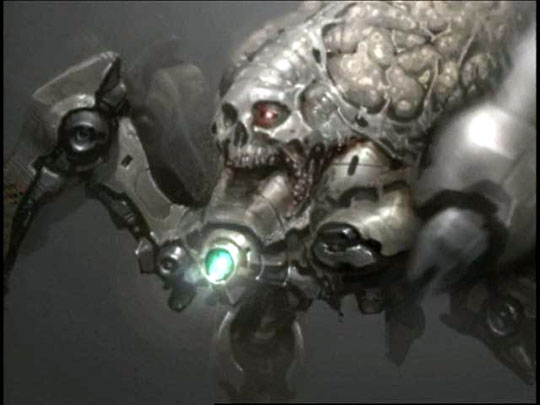
Or, for something less self-promotional, this classic teaser concept art for Doom 3 that had every hyped up before the game was fully revealed. This is fucking perfect. WHY WAS IT NEVER ACTUALLY USED.

Where are my eldritch bovidae motifs with cold, menacing eyes that glare at me like I'm an insignificant annoyance???


 Author
Topic: DOOM: KNEE DEEP IN THE WAD (Read 14949 times)
