Bay 12 Games Forum

Please login or register.

Login with username, password and session length
Advanced search  
Pages: 1 ... 9 10 [11] 12 13 ... 178

Author Topic: Steam/Itch.io tileset - Mayday/Ironhand - Discussion and Suggestions  (Read 461417 times)

Meph

  • Bay Watcher
    • View Profile
    • worldbicyclist
Re: Steam DF tileset - Mayday/Meph - Discussion and Suggestions
« Reply #150 on: March 16, 2019, 06:05:59 am »

So... I had a try at ramps myself.


PS: Hypnopompic asked about the little dots/dashes in unmined, unrevealed rock. I put them in. :)

5-z-lvl example:


Example with different z-levels of trees: (SUPER WIP)


Edit: IMPORTANT! It's not clear if there will be any multi-level view coming, so please ignore the different z-levels above. I'm just curious about the ramps, thank you. (They were created with multilevel-view in mind though, just in case, that's why I had to test it.)
« Last Edit: March 16, 2019, 07:08:12 am by Meph »
Logged
::: ☼Meph Tileset☼☼Map Tileset☼- 32x graphic sets with TWBT :::
::: ☼MASTERWORK DF☼ - A comprehensive mod pack now on Patreon - 250.000+ downloads and counting :::
::: WorldBicyclist.com - Follow my bike tours around the world - 148 countries visited :::

gimli

  • Bay Watcher
    • View Profile
Re: Premium DF tileset - Mayday/Meph - Discussion and Suggestions
« Reply #151 on: March 16, 2019, 06:33:47 am »

Not really related to the tileset, but now that you guys have a direct line to the Toad about graphical changes to the game, do you think it would be feasible at all to make movement animations more fluid? So that instead of teleporting from tile to tile, the sprites would actually slide along the path?
Here's an example gif of how it looks in KeeperRL:
https://cdn.discordapp.com/attachments/467795961406816276/531687892381335552/Peek_2019-01-07_15-15.gif

I like this! This should be added for the Steam version. [+ I never heard about this KeeperRL game, gonna check it out.]
Logged

CarpBiter2000

  • Bay Watcher
    • View Profile
Re: Steam DF tileset - Mayday/Meph - Discussion and Suggestions
« Reply #152 on: March 16, 2019, 07:44:05 am »

I'm just curious about the ramps, thank you
Can you please show one without so many Z-levels, to get an impression how the ramps look in the context of an actual fortress? Because right now it's like the entire place is underwater, only there is no water, and it's very distracting.
Logged
The lake unfroze, the ducks drowned.

TwistedMinds

  • Escaped Lunatic
    • View Profile
Re: Steam DF tileset - Mayday/Meph - Discussion and Suggestions
« Reply #153 on: March 16, 2019, 07:50:37 am »

Heya Meph, I like your figurines, but I have a nagging feeling they would look too similar to living beings in a room full of people. What about flipping them horizontally (weapons on the right) instead?
« Last Edit: March 16, 2019, 08:05:43 am by TwistedMinds »
Logged

Meph

  • Bay Watcher
    • View Profile
    • worldbicyclist
Re: Steam DF tileset - Mayday/Meph - Discussion and Suggestions
« Reply #154 on: March 16, 2019, 08:00:51 am »

I'm just curious about the ramps, thank you
Can you please show one without so many Z-levels, to get an impression how the ramps look in the context of an actual fortress? Because right now it's like the entire place is underwater, only there is no water, and it's very distracting.
They either work with multiple z-lvls, or get scrapped and replaced with something that does.

I'm not sure if I understand what you mean with underwater. (Edit: No, wait, I think I do. Because it gets darker the deeper the zlvls go.)
« Last Edit: March 16, 2019, 08:11:57 am by Meph »
Logged
::: ☼Meph Tileset☼☼Map Tileset☼- 32x graphic sets with TWBT :::
::: ☼MASTERWORK DF☼ - A comprehensive mod pack now on Patreon - 250.000+ downloads and counting :::
::: WorldBicyclist.com - Follow my bike tours around the world - 148 countries visited :::

silvernocte

  • Bay Watcher
  • Favorite color is Adamantine
    • View Profile
Re: Steam DF tileset - Mayday/Meph - Discussion and Suggestions
« Reply #155 on: March 16, 2019, 08:08:42 am »


well it's certainly come a long ways from the reveal ramps
Logged

LordBalkan

  • Bay Watcher
    • View Profile
Re: Steam DF tileset - Mayday/Meph - Discussion and Suggestions
« Reply #156 on: March 16, 2019, 08:18:55 am »


We can already name stockpiles, maybe displaying the stockpile's name on screen wouldn't be a bad idea. Kinda like Prison Architect, but that game goes with a whole "floor plan" kind of art style and this wouldn't work with very small stockpiles:

Problem about icons is that they don't work well with custom stockpiles and it could be confusing to tell what is just an icon of an item and what is an actual item.

Exactly what I had in mind when the suggestion came! (Didn't play Prison Archtect long enough to get used to all stuff hehehe)
And yeah, now you said it would be a little confuse to distinguish if it is an item on the ground or just the icon of the stockpile itself. The color kindda do the trick here, since the item icon displayed have the same brownish color-grade pattern for all "stockpiles-icon".
Didn't fully undestand what Cruxador said about the difficulties to change the color at will, but hope Meph and Mayday have something in mind about it.

So... I had a try at ramps myself.

Oh!! They are smooth! And also kindda short! My thing with the ramps from the beggining was because they lookd like were leading way too far from the ground, almost like a "isometric" view, like the walls on Tibia Online:
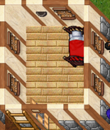
Nothing against the visual, just doesn't felt right since the idea is not a isometric view, just a top-down one.
But! Since you shown those shortned versions, its possible to maintain that way?


well it's certainly come a long ways from the reveal ramps
Edit: I do prefer the round-corners that Mayday displayed with the bottom smooth slopes that Meph made.  :P

About the trees.. well as the z-levels goes up the game tend to shown not only the trunk but also the branches and not tend to be just a round top. Yes, I've read that this is just a mockup, but I wanted to do this heads up since the view of highest levels would be not that simple. I guess... Overall, it looks like the Zelda: Link to the Past and its fine heheheh.

Oh! Almost forgot

The beehives... well the boxes would be also nice, but for the sake of representation the medieval its for the best.

And for the floodgates, actually o do like more the real floodgate, resembling an elevate door with chains.
I mean, it's not a construction made on the place, it's a structure that can be carried.

« Last Edit: March 16, 2019, 08:23:00 am by LordBalkan »
Logged

CarpBiter2000

  • Bay Watcher
    • View Profile
Re: Steam DF tileset - Mayday/Meph - Discussion and Suggestions
« Reply #157 on: March 16, 2019, 08:22:01 am »

I'm not sure if I understand what you mean with underwater.
Have you ever seen a lake with very clear water, and how it gets gradually more dark the deeper it is?


well it's certainly come a long ways from the reveal ramps
I think Mayday's ramps look the most readable.
Logged
The lake unfroze, the ducks drowned.

Oab

  • Bay Watcher
    • View Profile
Re: Steam DF tileset - Mayday/Meph - Discussion and Suggestions
« Reply #158 on: March 16, 2019, 08:24:14 am »

I think the primary goal should be about proper visual representation.

Here are some things I think are important, especially for new players.

Highest level profession determines the sprite which does not always match their current job, which has already been mentioned. I have a suggestion for this.
Add tools/outfit that dwarfs must equip to be able to convert to a new profession, which in turn would change their sprite. Blacksmith hammer/apron could be equipped when the dwarf uses that professions workshop for example. Similar to how dwarfs change into a military uniform.

The amount of sprites without variations is already insane; seriously the workload here is absolute madness. To reduce this workload down I would consider doing as much of the art as possible in a modular manner.

For instance someone mentioned how a dwarf missing a limb would be represented visually? Why not draw different arms and legs which could be drawn to visually represent different conditions.

This could also be used for forgotten beasts and were beasts to better match their descriptions and save time creating hundred of unique sprites.

 To go one step further this could be used to create body parts for corpses when limbs are severed.

So in a nutshell you would have a torso, arms, legs, head, hair, than equipment over those. This is how I made all my sprites. Everything gets drawn separately then I Frankenstein them together. This reduced my workload tremendously.

Trees should get the same treatment as walls. There isn’t any other way to properly represent them with the canopy in mind. Meph I would add shadow showing where the canopy is for the ground layer of the tree.


Logged

Meph

  • Bay Watcher
    • View Profile
    • worldbicyclist
Re: Steam DF tileset - Mayday/Meph - Discussion and Suggestions
« Reply #159 on: March 16, 2019, 08:39:20 am »

Quote
About the trees.. well as the z-levels goes up the game tend to shown not only the trunk but also the branches and not tend to be just a round top. Yes, I've read that this is just a mockup, but I wanted to do this heads up since the view of highest levels would be not that simple. I guess... Overall, it looks like the Zelda: Link to the Past and its fine heheheh.
That... is only semi-correct. The trees in the mock-up are shown exactly like they would be shown ingame. Top level of a tree are only leaves,  btw, in my own tileset I do use the tree-trunk sprite from Zelda: Link to the Past. :D one of the easter eggs in the set.


Quote
Highest level profession determines the sprite which does not always match their current job, which has already been mentioned. I have a suggestion for this.
Add tools/outfit that dwarfs must equip to be able to convert to a new profession, which in turn would change their sprite. Blacksmith hammer/apron could be equipped when the dwarf uses that professions workshop for example. Similar to how dwarfs change into a military uniform.
No way. That's a game-play mechanic change adding new items and uniforms, just for graphics. That won't be done.

Quote
For instance someone mentioned how a dwarf missing a limb would be represented visually? Why not draw different arms and legs which could be drawn to visually represent different conditions.
That's what we are doing already with the equipment and procedually generated stuff. If injuries are shown, it will work the same way.

Quote
This could also be used for forgotten beasts and were beasts to better match their descriptions and save time creating hundred of unique sprites.
yes we are planning to do just that.

Quote
To go one step further this could be used to create body parts for corpses when limbs are severed.
corpses get a fitting sprite per creature.

Quote
Everything gets drawn separately then I Frankenstein them together. This reduced my workload tremendously.
I know. ;) That's how I made 1000+ civ sprites 2 years ago: https://imgur.com/a/6jUOL

Quote
Trees should get the same treatment as walls. There isn’t any other way to properly represent them with the canopy in mind. Meph I would add shadow showing where the canopy is for the ground layer of the tree.
I really hope that trees get the same directional context as walls, otherwise they would look... bad. They need to know where the border is between leaves and open-space. The shadow is a cool idea, someone else already mentioned that yesterday. Here a mock-up:


NO IDEA (!) how feasable that tree-shadow is though. It's something that hasn't at all come up in the talk with Tarn yet.

It does look good, but... why do trees give shadows, but a roof wouldn't? The game has inside/outside light/dark tiles, which are ignored. Trees would be the only exception, and the tiles below them are certainly outside/light... yet darkened by shadow. ^^
Logged
::: ☼Meph Tileset☼☼Map Tileset☼- 32x graphic sets with TWBT :::
::: ☼MASTERWORK DF☼ - A comprehensive mod pack now on Patreon - 250.000+ downloads and counting :::
::: WorldBicyclist.com - Follow my bike tours around the world - 148 countries visited :::

Meph

  • Bay Watcher
    • View Profile
    • worldbicyclist
Re: Steam DF tileset - Mayday/Meph - Discussion and Suggestions
« Reply #160 on: March 16, 2019, 09:19:24 am »

Super simple Siege Workshop. It pretty much only makes ballistas/catapults, so that's what you get. ^^

Logged
::: ☼Meph Tileset☼☼Map Tileset☼- 32x graphic sets with TWBT :::
::: ☼MASTERWORK DF☼ - A comprehensive mod pack now on Patreon - 250.000+ downloads and counting :::
::: WorldBicyclist.com - Follow my bike tours around the world - 148 countries visited :::

Dragonsploof

  • Bay Watcher
    • View Profile
Re: Steam DF tileset - Mayday/Meph - Discussion and Suggestions
« Reply #161 on: March 16, 2019, 09:59:43 am »


well it's certainly come a long ways from the reveal ramps
I really like the look of Meph's ramps.
Logged

CLA

  • Bay Watcher
    • View Profile
Re: Steam DF tileset - Mayday/Meph - Discussion and Suggestions
« Reply #162 on: March 16, 2019, 10:12:59 am »

[no idea] how feasable that tree-shadow is though.
I can't imagine it being much different from other "layer projections". In fact, it seems easier to give everything a shadow - i.e. use darker shaded tile everywhere where there's a solid object on z+1 - much like you would show lower elevation levels. The top-down view on the trees looks much better by the way.

Non directional shadow on the ramps looks also much better I think (the ones titled "Meph"). I think it would look better when the gradient between floor and ramps leading upwards is more soft, and there's a more visible barrier between the floor and the ramps leading to the level below. It makes it visually clearer that the "up ramps" belong to the current level and the "down ramps" are just "up-ramps" of the level below.
That way it's communicated to the player that a level consists of a floor and its wall/ramp etc on top. The shadow seen on the middle mockup ("Mayday") feels wrong to me for that reason.

Logged
CLA - an ASCII-like Graphic Pack with simplified letter-like creature graphics. The simple and clean looks of ASCII with distinct creature graphics - best of both worlds!

http://www.bay12forums.com/smf/index.php?topic=105376.0

Cruxador

  • Bay Watcher
    • View Profile
Re: Steam DF tileset - Mayday/Meph - Discussion and Suggestions
« Reply #163 on: March 16, 2019, 10:15:44 am »

Edit: Floodgates... Do you think they are a bit like a dam?


Mh... technically they should look like this:


But that's not really 32x32, but 46x66. :/
If you consider that floodgates are only one tile big, they're probably more comparable to the floodgates in irrigation channels. But on the other hand, they're powered by mechanism, not by hand. And... They're totally binary, so not really floodgates in any modern sense at all. I haven't found any information on how medieval floodgates could have been different. But if you consider that they block an entire tunnel without any part protruding to the above z-level and basically disappear when open, the "double door" style of floodgate might be most appropriate.
Heya Meph, I like your figurines, but I have a nagging feeling they would look too similar to living beings in a room full of people. What about flipping them horizontally (weapons on the right) instead?
Rotating them so they're lying on their backs as if discarded would probably be even more distinct.

Logged

Meph

  • Bay Watcher
    • View Profile
    • worldbicyclist
Re: Steam DF tileset - Mayday/Meph - Discussion and Suggestions
« Reply #164 on: March 16, 2019, 10:36:07 am »

I just make new figurines. ^^

But if everyone thinks that they look like creatures, so be it. I present to you, after years of hard labor, the mountain gnome and the dark gnome:


:P

Mike is the one actually hard at work, refining the shaded ramps. I'm sure he will pop up momentarily. :)

Quote
Non directional shadow on the ramps looks also much better I think (the ones titled "Meph"). I think it would look better when the gradient between floor and ramps leading upwards is more soft, and there's a more visible barrier between the floor and the ramps leading to the level below. It makes it visually clearer that the "up ramps" belong to the current level and the "down ramps" are just "up-ramps" of the level below.
That way it's communicated to the player that a level consists of a floor and its wall/ramp etc on top. The shadow seen on the middle mockup ("Mayday") feels wrong to me for that reason.
It's a first try, I just wanted to know if people understand that style better than the ramps with directional shadow. I kinda like that they blend in that well, but it would be easy to add something like a 1-pixel edge somewhere to make it clearer.
Logged
::: ☼Meph Tileset☼☼Map Tileset☼- 32x graphic sets with TWBT :::
::: ☼MASTERWORK DF☼ - A comprehensive mod pack now on Patreon - 250.000+ downloads and counting :::
::: WorldBicyclist.com - Follow my bike tours around the world - 148 countries visited :::
Pages: 1 ... 9 10 [11] 12 13 ... 178