[Cross-posted from the devblog here--follow link for better formatting and light-on-dark style.]A while back I mentioned a design initiative based on the concept of "
map dynamics," aimed at increasing player focus on the map area as opposed to the message log or other windows. After the initial spate of related features and animations, this part of development was put on hold as the rest of the game took shape.
With much of the game complete, and development inching ever closer to needing a more polished-looking dynamic interface before reaching out to the average gamer, it was about time to revisit this topic since we could now identify all the necessary features and implement them in a consistent manner all at once.
Before now we didn't have a dedicated system for handling the large number of UI animations that would layer over the map area, as it's tough to design a system without knowing the full extent of what you need it to handle. The resulting implementation (i.e. code-wise) is less flexible than I'd like it to be, but on the outside it looks cool and the style is consistent throughout. (At this point I'm happy to sacrifice code quality if it'll get results, but I'll stop myself wherever it threatens to screw me over in the future).
Might as well pick up where we left off in February.
I went back to the "explosion prediction" feature and added brackets that show the explosion's maximum theoretical area of effect, just for reference since you can already see the more important shades of color representing damage falloff and obstacle blocking.
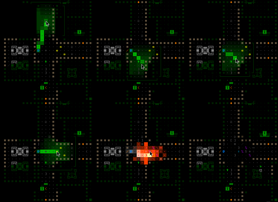
Explosion Prediction System 2.0 (I predict... you're all going to die. I was right!)
There was more pure "fluff" animation I wanted to add to the UI for missiles and explosions, but that was cut as a feature unnecessary for 1.0. Almost every other animation on the list was implemented, because they offer meaningful feedback or other information to the player.
Object IdentificationNo, I'm not talking about the "ID minigame" (subsystem) present in many roguelikes. More basic than that, the first step before you can take each action in a game is to identify what's what in the environment around you. Although proponents of tile-based games might argue otherwise, this isn't an issue unique to ASCII roguelikes. Sure objects are represented by letters instead of images, but the devil is in the details and you really need to know exactly what you're up against (enemies) and what tools are available (items). Images don't convey that information perfectly until you've learned what the game tells you they are, which is no different from an ASCII interface!
I remember holding the Alt key in Diablo 2 (sort of a roguelike, yeah?) to instantly see names for all items on the ground. That sure saves a lot of time and makes sense in any game where loot is plentiful (Diablo, Cogmind...)
ItemsYou can now call up labels for all items on the map, even those outside your field of vision in areas that you've visited before.
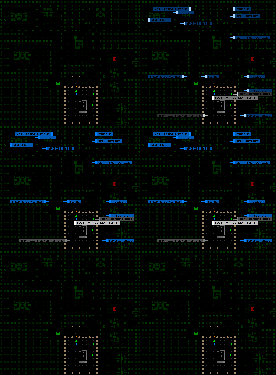
Item labels.
This is great for both surveying all items in view, and locating some item elsewhere on the map that you may not have cared for earlier but now really need and can't recall where you saw it. Of course, depending on why this hypothetical item was there in the first place, it may be
gone when you arrive! Remember that recyclers clean up after a battle, or if they find items strewn about where they're not supposed to be (e.g. your stash).
In the 7DRL you would know this item was already gone, because (no one ever mentioned it, but) back then you could technically see doors being opened/closed, walls being destroyed/repaired, and items being dropped/picked up
outside your field of vision as long as you had been to that area of the map before. It just wasn't very noticeable under the green overlay; plus you probably wouldn't expect the game to be so lenient in that regard. For the prototype I never had time to code a solution to properly record and conceal everything. As part of this latest update, explored areas of the map no longer automatically reflect changes since you've been there. They remain as you last saw them, including even labels for items that no longer exist.
With these and other labels below you can also see additional benefits from having a separate font for text and map (an idea I've discussed
before): More label content fits in a smaller area, and the narrower font helps naturally distinguish label information from the rest of the map, an important necessity in ASCII roguelikes since the map consists of mostly alphanumeric glyphs as well. You'll notice that to reinforce that difference I've opted to use a style which inverts foreground and background colors.
RobotsLabels on Demand are also available for the other most common map object: robots. Hostile and allied robot labels are activated separately. They display the robot class (not full name), and are color-coded by that robot's remaining core integrity (from green to red).
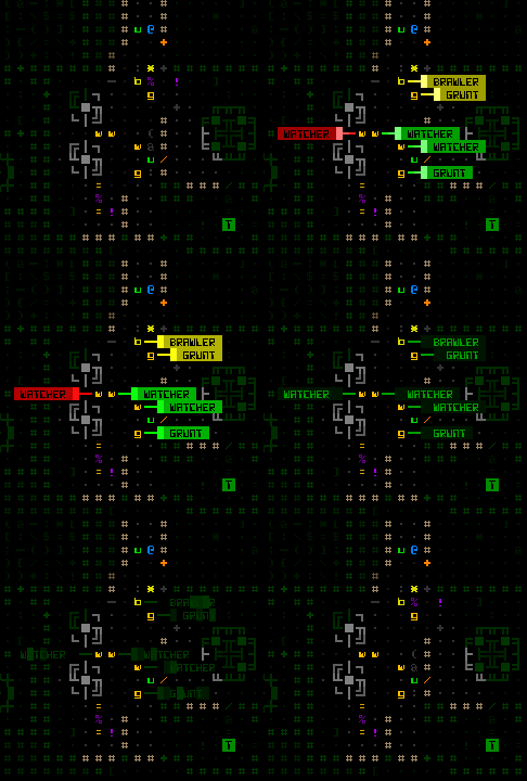
Robot labels (hostiles).
Disarmed combat robots will be labeled instead with gray, so you know they are no longer a threat.
Notice that with all labels they automatically attempt to reorient themselves to avoid covering each other or important features (other similar objects):
Auto-orienting labels organizing themselves into the most visible arrangement possible.
Where there's a really huge cluster of items/robots some overlap will be unavoidable, in which case there's always the original scan window as a fallback for identifying objects. Plus that gives you more detailed information, anyway.
ExitsThe whole point of the game is to move forward, so finding map exits is a very high priority. Finding the
right exit is even more important since they don't all lead to the same place and you won't always want to immediately head through the first exit you find. Thus exit labels are fairly important and useful to have access to.
Calling up labels for exits will pinpoint their location as well as display the name of the destination,
if known. Unknown exits appear labeled with question marks:
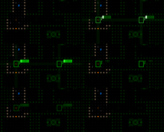
Exit labels.
While there's nothing stopping you from entering an unknown exit (except FEAR! =p), you will often want to do a bit of hacking to figure out where exits lead.
Because Cogmind maps are quite large compared to the average dungeon roguelike, it's very likely that exits will be out of the map view area. Thus when you activate exit labels, they will identify even those previously discovered which are now off screen--if you can't see a label it will show an alternate label (simply the name of the exit) at the edge of the view in the direction of that exit. These labels automatically reorient themselves along the map edge as you shift the view.
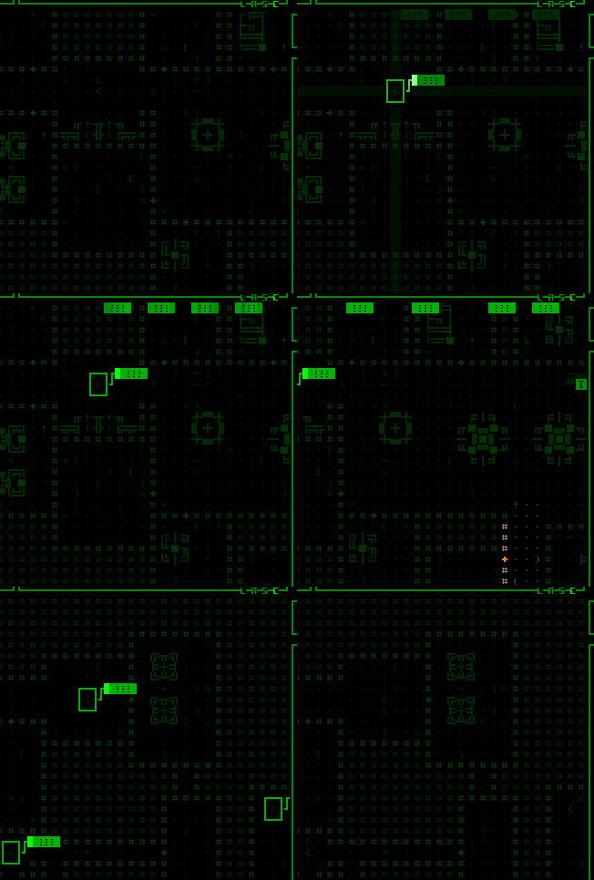
Shifting the map to seek off-screen exits.
We can take this system one step further by
automating label displays where it makes sense.
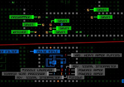
Now when you spot a new hostile robot for the first time it will automatically be labeled directly on the map (with its full name rather than the class designation shown for manual labels).
All newly spotted items are labeled as well--it is AMAZING how useful this is compared to the 7DRL where you had to mouse over each item to identify it. Using look mode via the keyboard to tab between visible items was/is pretty fast, but "fast" can't really compare to "instant"

. Simply by walking into a new room you can tell if it contains anything you want.
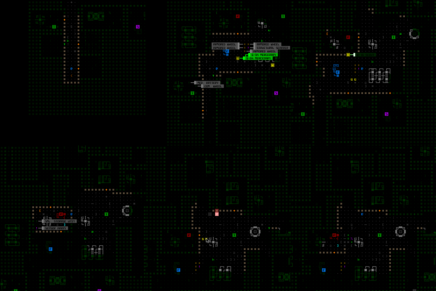
Auto-labeling items and robots. For the grand finale I blow them all to pieces.
Unlike manually accessed labels which only display one type of object at a time (either robot or item), as you move around automatic labels of either kind might appear, so you'll notice they use a different color scheme to avoid confusion. While robots are labeled green to red by remaining integrity, common items are gray, prototypes are white, and anything outside your current field of vision is blue. (There's a fourth classification with its own color, but that one's a secret.)
Auto-labels for threats and items are individually toggleable in the options menu, if you don't want them.
Auto-labeling of exits is accompanied by a recognizable beep that should stand out from the other interface noise, since exits are so important, though the larger label size will make it pretty apparent:
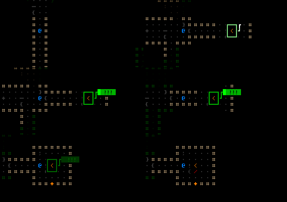
Finding and approaching an exit.
We're kinda running out of keys on the keyboard--how are we supposed to control manual labels?
First of all I freed up the numbers. They were originally used to access information about inventory objects, but that was actually a minor inconsistency in the input scheme I've been wanting to change anyway. Inventory item information is now Shift-#, which corresponds nicely to the Shift-a~z used for attached part information.
Press a number 1~4 to label hostiles, allies, items, or exits. Pressing the same number again, or Esc, will deactivate the labels immediately if you don't want to wait two seconds for them to expire and disappear on their own.
We're also running out of UI space, so a new solution was required for mouse support. Fortunately object label buttons fit nicely, both physically and conceptually, in the existing scan window. The buttons need not be always visible, so simply hovering the cursor over what is normally an informational scan window switches its contents to a list of buttons that can be clicked to call up labels (or cancel them if you click again).

Using the mouse to access labels.
Note that if there are no objects of the desired type to label, a message is shown to that effect at the top of the map view.
While keyboard look mode won't be as useful anymore given that you can display map-wide labels instantly, it also auto-labels any object the cursor passes over. The name and details also appear in the scan window as usual, but it's nice to not have to move your eyes away from the map.
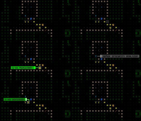
Object auto-labels in keyboard "examine mode." At the end of the recording I'm using hotkeys to automatically cycle between robots/items rather than shifting the cursor via movement keys.
Side note: I wonder how many players will actually use pure keyboard mode? Or whether anyone besides myself used it to play the 7DRL?
CombatThe labels introduced above are all useful both in and out of combat. We also have a collection of new labels that provide combat-specific feedback.
After a certain (adjustable) delay on entering targeting mode, the map displays the chance to hit each hostile robot in FOV.
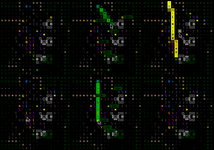
Automatic hit% labels in target mode.
Where combat is concerned, the results of an attack are the most important feedback element, one that wasn't too obvious in the 7DRL. Back then I did add a "calculations" window in which you could see the values used in the attack formula along with precise results.
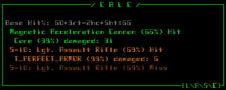
The calculations window showing more specific attack results. (That armor I happen to be using for testing so I don't get hurt =p). The level of detail shown is adjustable in the options. Content is also scrollable just like other log/message windows.
That window still exists (above), but we can make the most important information much easier to obtain through more on-map auto-labels for attack effects. If an attack damages a target's core (not a part), the map will flash that robot's remaining core integrity (as a percent). Destroyed parts are also named, and there's an indicator when a core is temporarily disabled (some electromagnetic attacks).
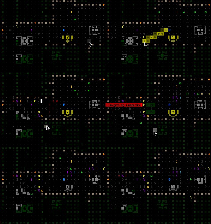
Attack effect auto-labels, Cogmind's version of the "floating numbers" you see in many games.
The system was originally also showing white numbers for EM-caused system corruption, but I decided to remove that for now since I think it works better as an unknown factor.
Combat labels are entirely optional because some players may consider them too intrusive. Attack effect descriptions do get in the way of enjoying the particle effects.
Being SpottedJust because you can see another robot does not necessarily mean it has already seen you, but this information was never communicated in any way in the 7DRL. Now whenever you see a robot that has started tracking you, the space it occupies will glow for a bit.
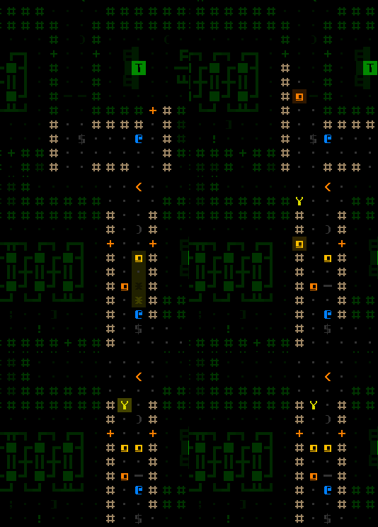
Spotted by several hostiles on entering a corridor.
Technically a hostile robot may have started tracking you before you saw it, if it got your location from another robot or simply has a greater sight range, but it doesn't glow until entering your FOV so you know it sees you. In case you missed the glow or aren't sure, this information is now reflected in the scan window with a red '!'.

This robot has spotted and is currently tracking you.
Now that we have a more reliable way of knowing whether you've been spotted, I'd like to eventually add ECM mechanics that can temporarily prevent robots from noticing you even when you're in their FOV. This would make melee approaches more interesting and provide another tool for the stealth-oriented build. There is already a set of ECM parts, but they only work to escape detection after being spotted and tracked rather than avoid detection in the first place. [New ECM mechanics are for much later, since we're beyond the point of adding unplanned features until at least the first release.]
The next post will examine more feedback features (and UI animations!), especially as it relates to utility parts.

 Author
Topic: Cogmind (sci-fi robot-themed roguelike) - BETA RELEASED (Read 304151 times)
