Bay 12 Games Forum

Please login or register.

Login with username, password and session length
Advanced search  

Poll

No poll?

That's right
That is right

Pages: 1 ... 73 74 [75] 76 77 ... 379

Author Topic: Stonesense - Old Official thread - Now locked  (Read 1732974 times)

CobaltKobold

  • Bay Watcher
  • ☼HOOD☼ ☼ROBE☼ ☼DAGGER☼ [TAIL]
    • View Profile
Re: Stonesense - The isometric visualizer, official thread
« Reply #1110 on: November 18, 2009, 04:23:20 pm »

Further that is a carpenter's shop constructed of wood. ;) Else, nice.

BORDERS
Logged
Neither whole, nor broken. Interpreting this post is left as an exercise for the reader.
OCEANCLIFF seeding, high z-var(40d)
Tilesets

Impaler[WrG]

  • Bay Watcher
  • Khazad Project Leader
    • View Profile
Re: Stonesense - The isometric visualizer, official thread
« Reply #1111 on: November 18, 2009, 04:39:49 pm »

Also the floor is wood and looks like its part of the workshop, this cant work, the floor is not part of a workshop and is rendered separately.  Other then that I really like to look and think it won't need the floor borders that are currently being used as the furniture and objects create a well defined space.

Solifuge:  Great improvements to the plants, I can't wait to see them in the works.
« Last Edit: November 18, 2009, 04:42:55 pm by Impaler[WrG] »
Logged
Khazad the Isometric Fortress Engine
Extract forts from DF, load and save them to file and view them in full 3D

Khazad Home Thread
Khazad v0.0.5 Download

dyze

  • Bay Watcher
    • View Profile
Re: Stonesense - The isometric visualizer, official thread
« Reply #1112 on: November 18, 2009, 04:52:22 pm »

Looks good. But what if there's no adjacent wall? Then the saw above the stack of logs would be floating in mid-air.

yeah, guess i'll have to do something about the saw ;D
the wooden floor is only a part of the mockup background, just something i thought looked good.
 
on second thought, you could actually render the floor into the workshop tiles, thus marking the boundraries of the workshop, while also getting rid of any square marker lines, as in the current ones.
« Last Edit: November 18, 2009, 04:54:40 pm by dyze »
Logged

Seuss

  • Bay Watcher
    • View Profile
Re: Stonesense - The isometric visualizer, official thread
« Reply #1113 on: November 18, 2009, 05:08:52 pm »

So I tried my hands at a willow again and this is the result:


The reason I'm still doing this, even though Seuss has already posted a beautiful willow, is that I'm trying to closely mimic Solifuge's style. I was afraid Seuss' willow wouldn't fit the general style of Stonesense, and thus I made this. This is a little mockup that shows how it would look like ingame. Please note I put my birch there, too  ::)

Spoiler (click to show/hide)


I'm willing to draw other trees, so please let me know whether you like it or not. Seuss, I'm not trying to step on your toes, and I love your plants! It's just that I like drawing stuff for Stonesense.
Vibrant colours like this?

Spoiler (click to show/hide)

First off my tree doesn't relay obey the rules of the tiles and shouldn't be used as such. It was more a practise sprite to test my abilities. Its also not the kind of willow tree you guys are probably used too.

I personally think your second sprite was better, that new vibrant green one is just too sickening and if you try to constrain your trees to what trees are already in the game you will end up will a bunch of sickly blobs. What you need to do is take that older sprite and add yellow to the highlights and deep aqua to the shadows. Generally a good way to pick a pallet is to find a mid tone that is the colour of you object then you highlight will be that colour with a bunch of yellow in it and more pale. Your shadow's should be your mid tone with a more rich blue in it and obviously darker. 2 reasons we use more yellow/warmer colours for highlights is because warmer colours pop out more and most light is yellow (sun, fire, electric lights)  If however your light source wasn't a warm colour then you would use that colour to mix with your mid tone but if in doubt use yellow. Shadows are kinda similar but your only doing it because cool colours reseed. This can be used as much or little as you like it comes down to style.
If I seem hard on you its because your so close and if you can get this right you will start to amaze yourself. ;)
I might make a tutorial/example later if people need it. :-X


Added solid-color boarders to Seuss' fantastic crop sprites, and a mockup comparison to show why:
You lose a lot of distinction in small-scale work, unless you add boarders, especially when a foreground sprite matches the color of the surface that it's on.

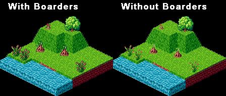


Personally I'm not a big fan of dark borders on environmental things, I feel it detaches its from the ground. Things with higher importance should have darker borders and I just don't value the shrubs to be that important. However if the vast majority want it I'll have to comply.

Stop using that tree. >:(


done some work on a carpenters shop


I'm digging that that workshop. 8)
Just the above mentioned floating saw. As far as flooring goes I recommend uploading it without and when/if we make a decision about workshop boundaries its an easy fix. However I understand if you want to know that decision sooner than later.
« Last Edit: November 18, 2009, 05:20:55 pm by Seuss »
Logged
“Reality is that part of the imagination we all agree on”

LegoLord

  • Bay Watcher
  • Can you see it now?
    • View Profile
Re: Stonesense - The isometric visualizer, official thread
« Reply #1114 on: November 18, 2009, 05:16:58 pm »

The screenshot of the underground forest is amazing.
Logged
"Oh look there is a dragon my clothes might burn let me take them off and only wear steel plate."
And this is how tinned food was invented.
Alternately: The Brick Testament. It's a really fun look at what the bible would look like if interpreted literally. With Legos.
Just so I remember

Footkerchief

  • Bay Watcher
  • The Juffo-Wup is strong in this place.
    • View Profile
Re: Stonesense - The isometric visualizer, official thread
« Reply #1115 on: November 18, 2009, 05:19:13 pm »

Yeah, I don't know what to think on the shrub borders either.  The strong borders make them stand out a little too much.
Logged

Neruz

  • Bay Watcher
  • I see you...
    • View Profile
Re: Stonesense - The isometric visualizer, official thread
« Reply #1116 on: November 18, 2009, 05:22:41 pm »

Maybe no borders for the natural shrubs, borders for the farmed foods?

strich

  • Bay Watcher
    • View Profile
Re: Stonesense - The isometric visualizer, official thread
« Reply #1117 on: November 18, 2009, 05:26:14 pm »

IMO I would border the top half of each plant - That way it appears to blend with the ground as it should at the bottom and we'd keep the detail of the top. WIN WIN. ;)
Logged

Footkerchief

  • Bay Watcher
  • The Juffo-Wup is strong in this place.
    • View Profile
Re: Stonesense - The isometric visualizer, official thread
« Reply #1118 on: November 18, 2009, 05:30:17 pm »

I almost hate to ask, but does anyone know about the feasibility of applying the border procedurally?
Logged

Dante

  • Bay Watcher
  • Dante likes cats for their corrupt intentions.
    • View Profile
Re: Stonesense - The isometric visualizer, official thread
« Reply #1119 on: November 18, 2009, 05:33:40 pm »

I noticed that the pictures that people were uploading to the Creature Sprites page weren't really lining up with the words, so I threw the Animals section into a few tables. I really hope this is okay; I don't know the etiquette on this kind of thing. If it's not, let me know--I wouldn't want to make the same mistake twice.

I also added some sprites I've been making.
Ah good, I was getting frustrated and stopped uploading stuff because it would always break the pattern of the lines.


As much as im against just scaling down real images of animals with a few edits, any sprite is better than no sprite ;)
Some of those animals, while nice, clash with the overall style of the game... but Id have to see them in action first I guess. Though they likely arn't the finished product.
Yeah, basically, I always play in savage areas for the challenge, and use any animal the elves and humans can bring me, so my forts in stonesense are just big messes of purple question marks. I'd rather replace those with at least-low quality sprites scaled from google images, in the absence of high-quality sprites.

If they're too useless, I can just keep them to myself to mod my stonesense sprite sheet with though.

Vince

  • Bay Watcher
    • View Profile
Re: Stonesense - The isometric visualizer, official thread
« Reply #1120 on: November 18, 2009, 05:49:52 pm »

I also like the no-border version a bit more.

I almost hate to ask, but does anyone know about the feasibility of applying the border procedurally?

Hm, I don't think that would be much of a problem when it happens while loading all the tilesets.
You could make every pixel black that is a) transparent and b) has a non-transparent neighbour
I don't think that would take long, it is O(n˛), though - but it only happens once you say "I want borders" and the tilesets don't have that much pixels.
Logged

CobaltKobold

  • Bay Watcher
  • ☼HOOD☼ ☼ROBE☼ ☼DAGGER☼ [TAIL]
    • View Profile
Re: Stonesense - The isometric visualizer, official thread
« Reply #1121 on: November 18, 2009, 05:56:19 pm »

it is O(n˛), though
it's O(n) if you allot 2n space. (eight or four checks per pixel is still O(n)), where n is pixels

It's like a game of life. ;)
Logged
Neither whole, nor broken. Interpreting this post is left as an exercise for the reader.
OCEANCLIFF seeding, high z-var(40d)
Tilesets

Footkerchief

  • Bay Watcher
  • The Juffo-Wup is strong in this place.
    • View Profile
Re: Stonesense - The isometric visualizer, official thread
« Reply #1122 on: November 18, 2009, 06:05:05 pm »

Hm, I don't think that would be much of a problem when it happens while loading all the tilesets.
You could make every pixel black that is a) transparent and b) has a non-transparent neighbour
I don't think that would take long, it is O(n²), though - but it only happens once you say "I want borders" and the tilesets don't have that much pixels.

Yeah, that's the quick and dirty way, but if you compare Solifuge's bordered version, the approach is more nuanced: 1) it's not uniformly black, and 2) the border doesn't surround every pixel, especially not diagonally.


Additionally, the aesthetics of the border may depend on the background.  I'm not sure how the above border looks against mud, stone, etc.

I know this is a lot of fuss to make over a few shrub sprites, but I do think the question of borders is going to have to be addressed in some coherent way.
« Last Edit: November 18, 2009, 06:07:43 pm by Footkerchief »
Logged

Neruz

  • Bay Watcher
  • I see you...
    • View Profile
Re: Stonesense - The isometric visualizer, official thread
« Reply #1123 on: November 18, 2009, 06:06:36 pm »

I'd say make the borders fade in slowly from bottom to top.

Vince

  • Bay Watcher
    • View Profile
Re: Stonesense - The isometric visualizer, official thread
« Reply #1124 on: November 18, 2009, 06:12:00 pm »

it's O(n) if you allot 2n space. (eight or four checks per pixel is still O(n)), where n is pixels

It's like a game of life. ;)

Ah, you're right - I thought about nxn bitmaps: "It's square? So it's O(n˛)!" :D

Yeah, that's the quick and dirty way, but if you compare Solifuge's bordered version, the approach is more nuanced: 1) it's not uniformly black, and 2) the border doesn't surround every pixel, especially not diagonally.
Additionally, the aesthetics of the border may depend on the background.  I'm not sure how the above border looks against mud, stone, etc.
I thought about just checking 4 times, anyway, not diagonally.
And about the color - maybe setting it to a 50-50 mix of black and background-pixel?

I think that could work - it won't look as good as hand made, but I believe it should look rather well.
Logged
Pages: 1 ... 73 74 [75] 76 77 ... 379