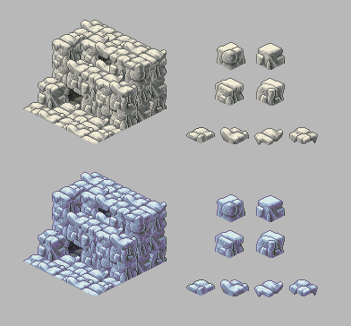
Sorry for hogging the thread ><
But I really appreciate all your thoughts on this.

This is working with the second mockup trying to get away from the constructed feel. Trying to smooth transitions and the harsh edges in the floor tiles. But fast post this must be!... for reasons unknown.
I'll edit in replies in a sec, but mostly i agree with all of you! 
I very much enjoy your "hogging the thread". If this is what happens when you do it, please do it more often... I don't believe anyone is complaining.

I'm definitely liking the organic shapes here, and with multiple textures it adds a lot of character to the stone. Reminds me of FFTA in a very good way too (some of the best pixel art of modern titles). Since I'm pretty sure everyone here will agree that this stuff is pretty badass, I'll do what I can to provide a critique. Here goes:
1) The dithering stands out in comparison to the other existing graphical assets, though in its own right looks just fine. It will make it tougher to create finer textures, though, as you'll need to suggest texture with larger shapes.
2) Remember that floors will sometimes be free-hanging, though those can be given separate graphics assets as well. Are you using separate floor tiles for the top tiles than you are between 2 stacked walls? If so, the same method would work for free-hanging floors, with hard edges on the bottom, and smooth transitions on the top. Hard transitions on top and bottom would work for thin walkways too.
3) Since these tiles aren't contained to a shear cube, some of the floors (namely the middle two floor tiles with the vertically projecting stone bits) occlude a lot of the tiles behind them, which would make it tough to see 1-tile cave openings and such (as evidenced by the topmost "cave" in the mockup). These floors also would look strange with sprites standing on them, since they're the most uneven floors. You may want to reduce the vertical projections a little bit, and keep them within a few pixels deviation from the main cube shape, to keep them from occluding too much.
Always make sure that the graphics don't interfere with understanding what's going on in the game. Anywho, it's looking great, and I'm excited to see where you go with these graphics!

 Poll
Poll
 Author
Topic: Stonesense - Old Official thread - Now locked (Read 1757555 times)

