Heh, that's great, Spreggo. You should totally post it there.
As for suggestions, something I think would help would be more careful differentiation of edges. Your portrait lacks any really hard-edged cast shadows (the end of the nose isn't casting one at all), which is hindering the illusion of the form somewhat. The general rule is that cast shadows, shadows cast by objects blocking the light, have hard edges (edges with no gradation), while form shadows, like the shadow over the curves of a sphere or any rounded surface, have soft shadows (shadows with gradation).
Elwell on CA.org had a good summary of this concept. (I'm sure you've seen this, but it might be worth posting anyway):
http://www.conceptart.org/forums/showthread.php?t=51913And the user GregPro did a
ton of incredible paintovers that covered this and similar stuff in depth.
http://www.conceptart.org/forums/showthread.php?p=2175210#post2175210http://www.conceptart.org/forums/showthread.php?p=2074018#post2074018http://www.conceptart.org/forums/showthread.php?p=2071958#post2071958http://www.conceptart.org/forums/showthread.php?p=1013886#post1013886http://www.conceptart.org/forums/showthread.php?p=1010747#post1010747http://www.conceptart.org/forums/showthread.php?p=1000884#post1000884http://www.conceptart.org/forums/showthread.php?p=1000256#post1000256http://www.conceptart.org/forums/showthread.php?p=1000135#post1000135http://www.conceptart.org/forums/showthread.php?p=995517#post995517One
other suggestion: I think your values are a little mixed up, and it's also confusing the form. I do this all the time, so I'm quick to notice it. Generally, you want the thing you're painting to have a light side, a shadow side, and
no competition between them; i.e., you don't want any of the shadows on your light side to be as dark as the shadows on the shadow side. And vice-versa; no lights on the shadow side should be as light as the lights on the light side. It's confusing in words, but simple in practice. Just tricky to get right unless you pay constant attention to it.
Here are GregPro's tutorials on the subject.
http://www.conceptart.org/forums/showthread.php?p=1010747#post1010747http://www.conceptart.org/forums/showthread.php?p=1013886#post1013886But your Nibru is awesome, and captures his tortured-yet-badass essence, I think.

In other news, here's something you guys might enjoy; a character design video by one of my favorite artists. He demos his painting process from line drawing to finished color-piece. I love videos like this, and this is an especially good one, I think:
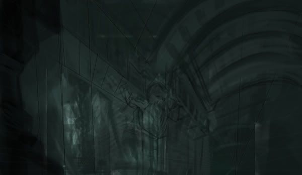
http://cgbootcamp.com/2009/09/23/character-concept-painting-process/And here's another environment WIP I've been scratching at here and there. Architecture is a huge weakness of mine, so I'm trying to do more of it. This is more DF fanart related.


 Author
Topic: +The Engravers Guild+ (Read 382908 times)
