Bay 12 Games Forum

Please login or register.

Login with username, password and session length
Advanced search  
Pages: 1 2 3 [4] 5 6 ... 296

Author Topic: +The Engravers Guild+  (Read 378065 times)

Spreggo

  • Bay Watcher
  • A vile force of darkness has arrived!
    • View Profile
    • skullsprout games
Re: +The Engravers Guild+
« Reply #45 on: September 20, 2009, 10:41:05 pm »

Sappho: You could try using something soft, like one of those eraser caps? I don't have a laptop to experiment with...

Balathustrius: Yeah it's just go over with the liquefy tool.  ;D

As for the brush settings, I normally smooth the gradients out after I block everything in. Although, I hadn't thought to set flow to the pen pressure, so I will definitely try that out on the next ones.

I think a decent way to do the highlights from torches (or glowing pits) and other light sources is to do the colors from them on a layer set to overlay. AFAIK overlay is sort of like a mixture of multiply and screen.

Chromie: I agree that GimpShop has a superior layout but that's probably just because I am used to PS.  :-\

Deon: I'm not sure if you are using one or two point perspective, but the top of the tower seems to go to a vanishing point separate from the lines on the ground. The lines of the bricks in the tower and gatehouse should go to the same point as the ground. If this looks too strange you may want to move the VP. The VP is generally at the viewers eye-level - but it looks like you know that since the eye level of the characters is about at that point.

I think you should put the face of a character real close to the viewer in that corner, peeking over. Mostly though because I think that would be funny. Or maybe some action? A scuffle or someone at work perhaps....

Edit: I added http://www.khangle.net/ to the inspiration section.
« Last Edit: September 20, 2009, 10:45:57 pm by Spreggo »
Logged

Balathustrius

  • Bay Watcher
  • [NO_SLEEP]
    • View Profile
    • In which I post pictures
Re: +The Engravers Guild+
« Reply #46 on: September 21, 2009, 03:37:20 am »


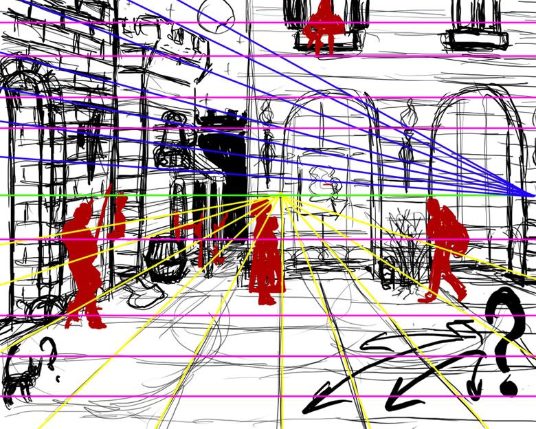
I think you're doing the perspective well.  I've traced where it looks to me like the horizon and the various vanishing points are in this paintover.

I'm not much of a perspective expert, but here's my thoughts:

Green is the horizon, or eye level.  All vanishing points, except those for inclined planes, have to sit on this line (they can be out of the frame, though).  (Any vp above or below this line will create an inclined or declined plane.)

-keep in mind that placing your horizon so close to the middle of the frame, as you've done here, can often result in a slightly stale, boring composition.  For more drama, move your horizon towards the top or the bottom of the picture plane, or even tilt it at an angle.

Blue traces to the vanishing point for the walls and tower.  Some of your lines here are off; they don't all go to the same vanishing point, even though they should be parallel.  (especially in the stonework).  Trace them to the point where the blue lines converge to fix this.

Yellow traces to the vp of the ground plane.  All looks well, here.

Purple goes to a vanishing point far, far off the frame, so far away that it's lines appear parallel.  It references the building in midground that we're seeing straight on; I just drew these for clarity.

The figures are done well; it looks like you know what you're doing, here.  All of their heads sit at about our eye-level, so we can infer that the ground plane is level, they're all relatively equal height, and we're looking on the scene from their height.

One thing I think it's important to remember; you can have as many vanishing points as you need for various objects; they just all need to sit on the same eye-level (horizon).  Sometimes it's necessary to add more vps, like when you're drawing an object that's rotated differently than other objects in the scene.

I think Spreggo linked Andrew Loomis' book Successful Drawing in the OP; that book has a great section on perspective in it.
Logged
You have struck Microcline!

Deon

  • Bay Watcher
  • 💀 💀 💀 💀 💀
    • View Profile
Re: +The Engravers Guild+
« Reply #47 on: September 21, 2009, 06:09:18 am »

I didn't know about the various vanishing points on a horison. And the stonework on the left is definitely messed up, but it's easy to fix. I just didn't know how to clarify "why" should these lines be here and there. I just sketched them on the fly, with my crappy eye measuring. It's good to know that my eye measuring is not that bad in the end.

Good idea about moving the horizon up/down (I think to lower it), I've tried it and it worked better (I knew there's something "wrong" or as you said "boring" here, I just couldn't find the cause).

You gave me 3 or 4 really good tips on the perspective, thank you. I will definitely read the book when I have more free time before I go further with the picture, I just had a small amout of time this weekend due to my physics diplom and I generally don't like to read books quickly or partially, I prefer to follow the author from the beginning to the end. So I thought it would be nice while I have 5-10 min of free time to attempt to get some free tips from you, and they really help me to start. Yeppee ;D.

Cheers.
Logged
▬(ஜ۩۞۩ஜ)▬
✫ DF Wanderer ✫ - the adventure mode crafting and tweaks
✫ Cartographer's Lounge ✫ - a custom worldgen repository

mendonca

  • Bay Watcher
  • [CLIVE]
    • View Profile
Re: +The Engravers Guild+
« Reply #48 on: September 21, 2009, 06:56:53 am »

Posting so I can follow this thread and watch it develop in to something beautiful.

Great stuff so far, (bizarrely) I love reading about the analysis of composition etc. something I'm not sure I have ever really considered.

As you were ...
Logged

Vester

  • Bay Watcher
  • [T_WORD:AWE-INSPIRING:bloonk]
    • View Profile
Re: +The Engravers Guild+
« Reply #49 on: September 21, 2009, 07:02:50 am »


With the paintings, you might try altering your brush settings a little for easier value transitions; it looks like you've got your opacity set to like 80% and size dynamics set to pen pressure, and the values aren't really blending together.  Maybe try setting the opacity to 100%, but turning on opacity jitter and flow jitter and setting them both to pen pressure.  Much more like a real paint-brush.  (opacity and flow settings are under 'other dynamics' in the brush window, which is F5 by default in ps, I think)

I just tried out the opacity and flow jitter. It really does look more natural.

EDIT:

Playing around with my new (terrible) tablet and photoshop with those brush settings.


It's Anon.

:(

That's the first thing I've ever tried to paint in photoshop.
« Last Edit: September 21, 2009, 07:48:57 am by Vester »
Logged
Quote
"Land of song," said the warrior bard, "though all the world betray thee - one sword at least thy rights shall guard; one faithful harp shall praise thee."

IndonesiaWarMinister

  • Bay Watcher
    • View Profile
Re: +The Engravers Guild+
« Reply #50 on: September 21, 2009, 10:41:33 am »

Ohayo.


I made it the other day.

And yeah, I SUCK. HARD.
Logged

Maggarg - Eater of chicke

  • Bay Watcher
  • His Maleficent Magnificence of Nur
    • View Profile
Re: +The Engravers Guild+
« Reply #51 on: September 21, 2009, 11:06:46 am »


I just tried out the opacity and flow jitter. It really does look more natural.

EDIT:

Playing around with my new (terrible) tablet and photoshop with those brush settings.


It's Anon.

:(

That's the first thing I've ever tried to paint in photoshop.

It's terrifying D:
Logged
...I keep searching for my family's raw files, for modding them.

Balathustrius

  • Bay Watcher
  • [NO_SLEEP]
    • View Profile
    • In which I post pictures
Re: +The Engravers Guild+
« Reply #52 on: September 21, 2009, 01:51:18 pm »


That's the first thing I've ever tried to paint in photoshop.

That's both cool and creepy.  And way better than my first photoshop attempts. 

Here's a small update on that glowing pits painting. Now with more glow!  Still needs work, obviously.

Logged
You have struck Microcline!

Hawkfrost

  • Bay Watcher
  • It's way too late to stop.
    • View Profile
Re: +The Engravers Guild+
« Reply #53 on: September 21, 2009, 02:01:24 pm »


That's the first thing I've ever tried to paint in photoshop.

That's both cool and creepy.  And way better than my first photoshop attempts. 

Here's a small update on that glowing pits painting. Now with more glow!  Still needs work, obviously.


You make so many pictures that are great as wallpapers.
Logged

Deon

  • Bay Watcher
  • 💀 💀 💀 💀 💀
    • View Profile
Re: +The Engravers Guild+
« Reply #54 on: September 21, 2009, 03:18:40 pm »

I want to make some more "good wallpapers" too :). Thanks god there're such great mentors and artists which give true inspiration by their works.

This glowing pit looks... Much different now. I was expecting it to become something else. It's great, and it's interesting how a tone change and different contrast make the picture to look as something totally new.
Logged
▬(ஜ۩۞۩ஜ)▬
✫ DF Wanderer ✫ - the adventure mode crafting and tweaks
✫ Cartographer's Lounge ✫ - a custom worldgen repository

Armok

  • Bay Watcher
  • God of Blood
    • View Profile
Re: +The Engravers Guild+
« Reply #55 on: September 21, 2009, 03:24:40 pm »

That image = awesome. Seriously, that's beautiful.
Is there any specific reason it looks so clean in there? Soap demons?
Logged
So says Armok, God of blood.
Sszsszssoo...
Sszsszssaaayysss...
III...

Davion

  • Bay Watcher
    • View Profile
Re: +The Engravers Guild+
« Reply #56 on: September 21, 2009, 04:15:17 pm »

A couple of inspirational websites:

Animation Backgrounds
More stuff on backgrounds
Scott Wills Backgrounds
Bill Wray Backgrounds
Bill Wray also does sweet fine art urban painting

A good thing to do, especially in this day and age, is build a personal library of all the inspirational images and media you find while on the internet. I have a couple of folders on my hard drive and an external devoted to concept art, background paintings, textures, video games, movies, photography etc. Anything I can pull off the net that might be a good reference or something I can use later or get inspiration from goes into that library. 

Obviously, a lot of the images from the above links are in my library, hehe.
« Last Edit: September 21, 2009, 04:22:00 pm by Davion »
Logged

Virex

  • Bay Watcher
  • Subjects interest attracted. Annalyses pending...
    • View Profile
Re: +The Engravers Guild+
« Reply #57 on: September 21, 2009, 04:36:37 pm »


That's the first thing I've ever tried to paint in photoshop.

That's both cool and creepy.  And way better than my first photoshop attempts. 

Here's a small update on that glowing pits painting. Now with more glow!  Still needs work, obviously.


You should apply for Wizards of the Coast ;)
Logged

Spreggo

  • Bay Watcher
  • A vile force of darkness has arrived!
    • View Profile
    • skullsprout games
Re: +The Engravers Guild+
« Reply #59 on: September 21, 2009, 05:14:05 pm »

Does anyone know if there are glowing fungi/plants in the DF universe?
Pages: 1 2 3 [4] 5 6 ... 296