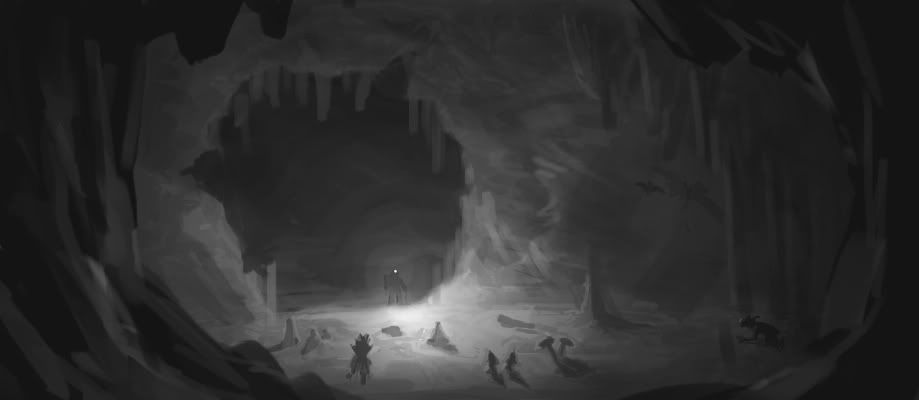
(I desaturated it and flipped the canvas, just to make it quicker to work on.)
I added a some pixels to one of the sides to balance out the composition; it was leaning pretty heavily to the right. It's easy not to notice this unless you're flipping your canvas horizontally every once in a while to check, so that's a good thing to do.
I upped the contrast, brightening the lights around the figure's torch and adding shadows elsewhere. Especially in a dark environment lit only with a single point-light source, you're going to have a lot of contrast. Plus, it makes the picture 'pop' a bit more.
-remember the rule of atmospheric perspective, especially when painting large environment pieces. The closer you are to the foreground, the more contrast you get; you find your lightest lights and darkest darks in the foreground. As you recede, contrast decreases; lights and darks get closer together. This is because the atmosphere (air, smog, etc.) has a blurring effect and decreases crispness, and the more air between your eye and what you're looking at, the greater the effect.
I added some foreground elements, which serve to frame the composition a bit and integrate the viewer into the picture. As a general rule, pictures benefit from having a foreground, a midground, and a background; the original didn't really have any foreground elements, which detached it somewhat from the viewer.
I added more stalactites and stalagmites, especially to add some noise to the cave maw, which was a somewhat boring, circular shape before. This just gives the eye more detail to look at and makes the picture more engaging.
That's about all. Hope that's somewhat interesting and maybe gives you some things to consider with your next piece.


 Author
Topic: +The Engravers Guild+ (Read 383667 times)
