There's a lot of discussion going on about presentation and interface, here are some of my suggestions that I think would improve the look and newbie-friendliness.
"Site a Building" Menu:
1. When you are in the Site a Building menu, it'd be nice if selecting a menu item such as Floodgate, when you don't currently have a Floodgate ready for placement, would still allow you to designate where you want the future item, and bring up one of the Workshops that constructs that item. Maybe that could open up multiple designations at some point and enable the option to place your beds where you want them before you even make them.
Having multiple designations for future items might bring up it's own problems, though. Like what if someone wants to edit their placement?
2. It'd be cool if there was a visual indicator that there are more options for a selection, too. Like maybe "Workshops +" to denote that when you select it there are more options for you to choose from.
3. Maybe rename "Site a Building" to "Construction", "Build", or something similar, because when I think of the word "buildings" I don't really think of beds, chairs, tables, floodgates, etc, might just be a nitpick on my part but I'm sure it confuses some people. I know when I first tried playing Dwarf Fortress I thought, "Oh?" when I went to build something and instead of seeing various workshops I saw armor stands and beds. That brings me to organization...
General Organization: Here are some visual suggestions that I think would make the readability and organization more solid:
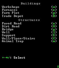
Page 1 of Site a Building
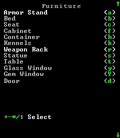
Page 2 of Site a Building
Page 3 of Site a Building
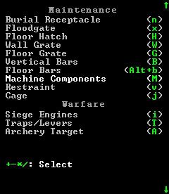
I think it'd be good to have the Workshops and other buildings at the top because many people coming into a game expect something like this. I also think that having an entire list on one page of the menu keeps someone from being overwhelmed with all the options, though it might not matter.
Alternate Organization: Another way to organize this would be to just have the categories listed, and then you select the category you want and the list opens up in a new menu. I opted for the above layout because it means it's one less keystroke/hotkey and people are use to it.
"Designation" MenuGeneral Organization: Here are some visual suggestions that I think would make the readability and organization more solid:
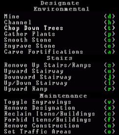
I think putting everything into separate categories makes things easier to visualize.
"Main" MenuOne of the big reasons I think people are turned off by the interface is because it doesn't look like anything they are used to seeing, here's a mock-up that could solve that problem, a context menu at the top instead of all the options on the side, leaving the side menu open for all the information:
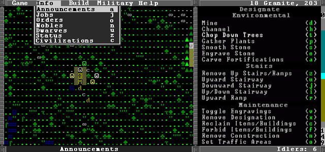
Could access the menus through F1-F12, and by mouse if support was added.
Game - Could include the options from when you hit Escape, along with Movies
Info - Announcements, Jobs, Orders, Nobles, Units/Dwarves, Status, Civilizations
Build - Designations, Stockpiles, Site Building, Building Tasks, View Rooms/Buildings, View Items, Zones, Notes
Military - Military, Squads, Army Arc stuff
Help - Tutorial, Wiki, Hot Keys
Another possible way to lay it out:
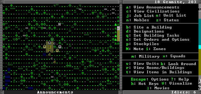
Separating everything into categories again, and breaking things up with dividers, could probably tighten it up a bit in my mock-up.

 Author
Topic: Interface Improvements (Read 2307 times)

