2018 7DRL Postmortem, Part 2: First Days with UI, Aesthetics, and Mechanics[Cross-posted from the devblog here--follow link for better formatting and light-on-dark style.]Picking up where we left off at the end of Part 1, which covered pre-7DRL preparation...UI, It BeginsThe first stretch of 7DRL week was an exercise in chopping up and reconstructing an existing UI in the most efficient way possible.
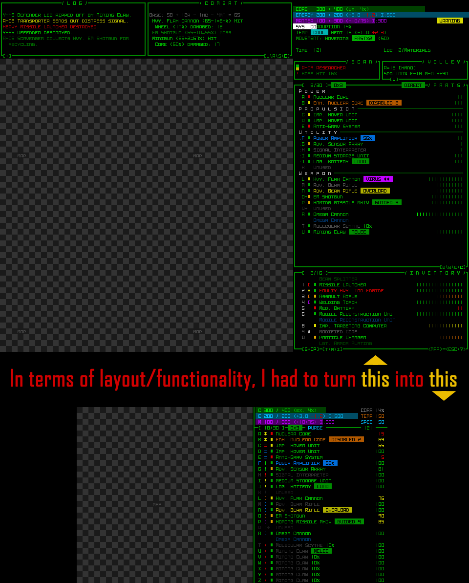
UI-first would be the best approach, since that would enable me to work on the display with the game content (initially equivalent to Cogmind Beta 5) remaining a known variable throughout that process, speeding it up.
Now a lot of those windows in the source material are no longer needed, but as one might expect, a sprawling code base is going to have all kinds of references to them and their contents, so outright removing them and hoping for a stable game is out of the question. What did I do instead? I moved them :)
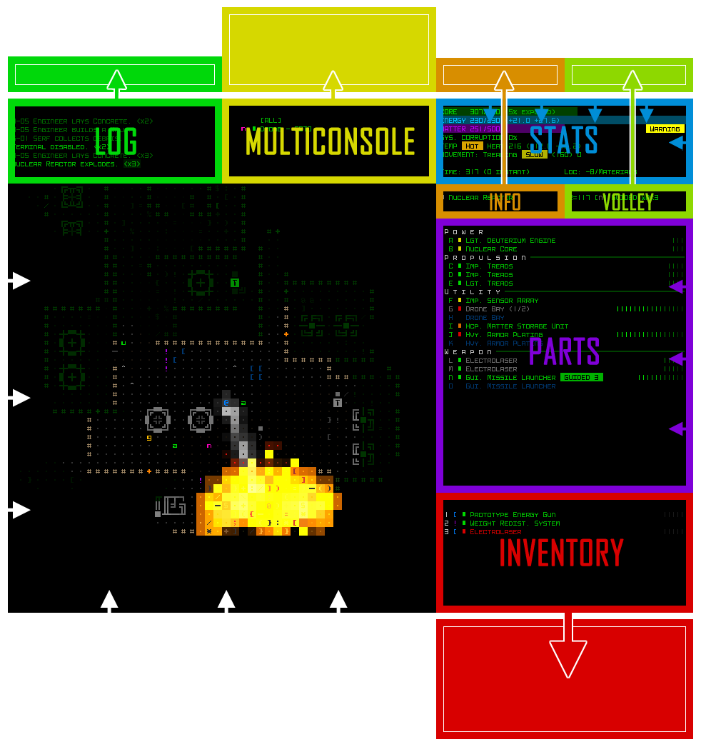 The default Cogmind UI layout, with arrows showing how consoles were either moved out of view or shrunk down for POLYBOT-7.
Hackish? Very. Easier than the alternatives? Hell yeah. I also blocked the commands that would otherwise interact with contents of those windows.
So technically while playing POYLBOT-7 there are a fair number of consoles that actually exist and are updating all the same, but aren't drawn to the viewing area because they're positioned off the screen.
One of the more specific interesting hacks is the message log. P7 still needs a message log but there's no room for it to always be visible like it is in Cogmind, so two solutions were used in tandem here...
Cogmind already has a system for printing the combat log (separate from the message log) directly to the map, so I instead hooked that system up to the message log itself--bam, messages now temporarily appear over the map :). Though I did have to alter its behavior to always scroll downward, and shift older messages up, rather than the cyclical approach used in Cogmind (which I
might go back and replace with this new one, not sure).
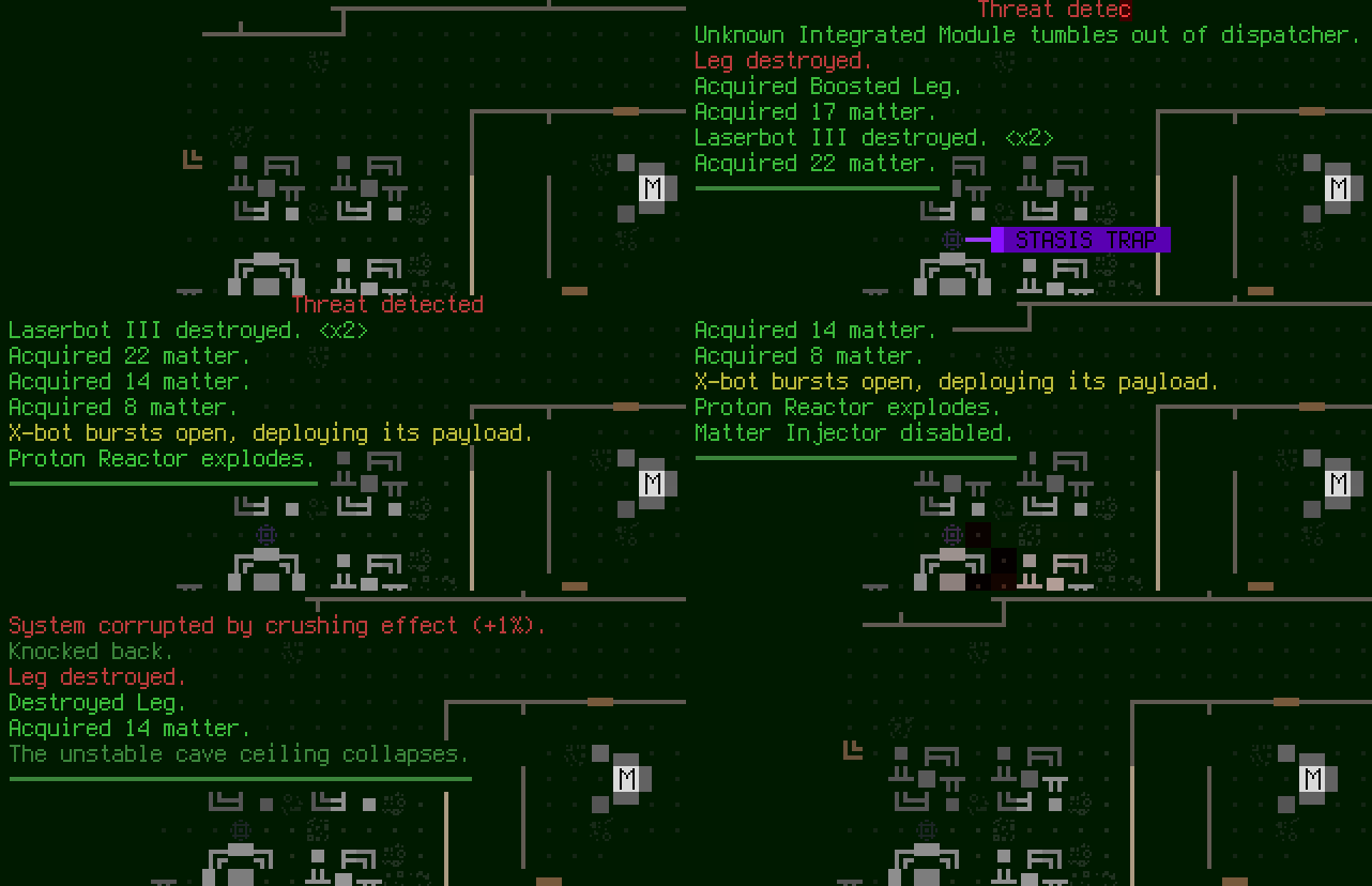 Sample log messages scrolling over top of the map.
But we can't have messages staying there forever, covering part of the map, plus we need a way to review older messages anyway, so we still need an interface to provide that functionality.
For that I came up with the idea of simply reusing Cogmind's "full message log." In the original, pressing F4 expands the message log to have it stretch all the way to the bottom of the screen, showing many more messages for faster parsing.
In POLYBOT-7, pressing 'm' both repositions the log window so that its top left corner is at (-1,-1) relative to the screen (to hide its title/borders) and expands its height so that the interior covers the map. Closing it with 'm' or Escape (or a click) then shrinks it again and moves it back up out of view.
Rather convenient that we allowed that dedicated message log window to continue existing off-screen, eh? :D
Here's what progress looked like when I had only adjusted a few of the windows so far; notice how the expanded log is opening just off the screen (later I turned
off the embedded turn numbers by default, since they'd waste precious log space in P7):
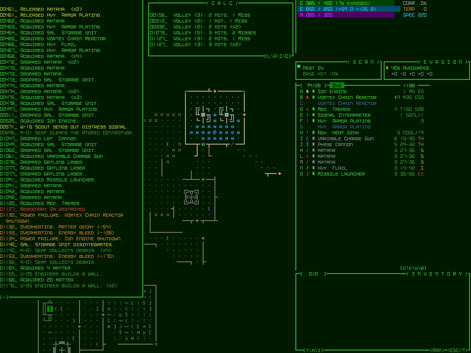
The message log originally spanned only half the width of the map, as in Cogmind, but I later widened it to match the map width and cover it entirely when open--may as well since there's room and it makes messages easier to read by requiring fewer newlines!
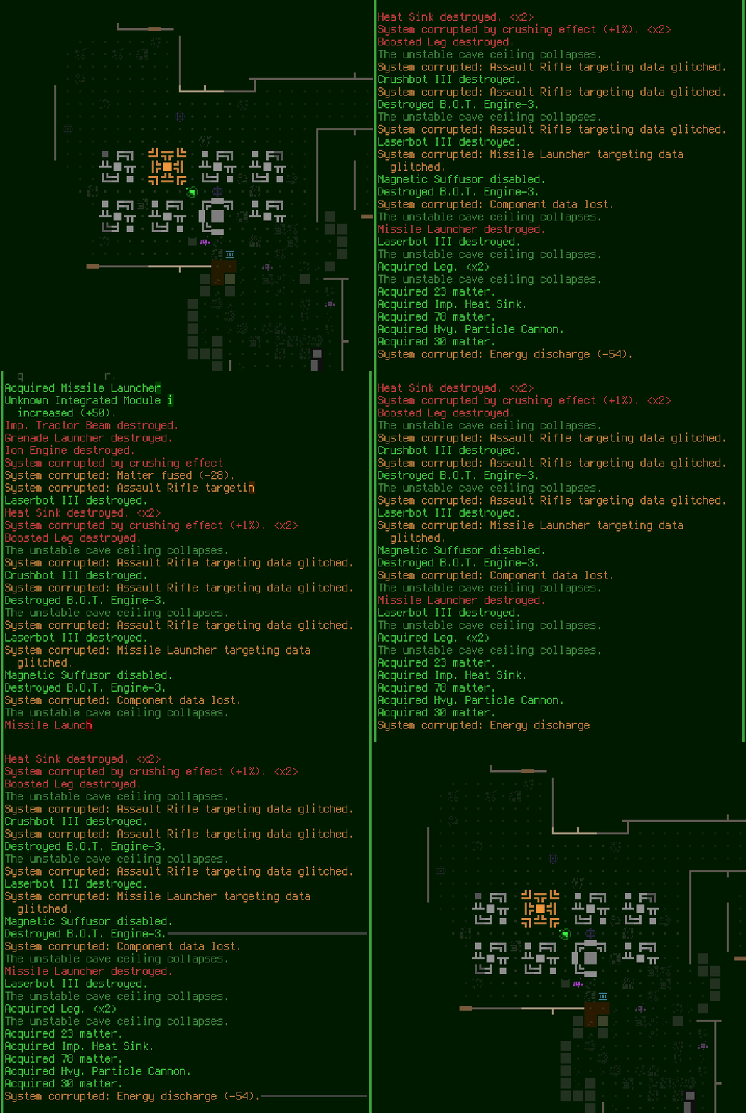 Opening the expanded message log over the map. Note that later I decided to keep its borders visible since it looked better given the way the fonts work (otherwise letters appear right up against the edge of the screen).
One of the last things I did before actually changing the main terminal dimensions was reorganize the help screen contents to approximately fit in what would be the target area. Here's a shot from when I wasn't quite done yet, but a lot of the contents are already gone:
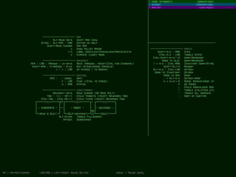
There wasn't enough time to build an accessible options menu, but a help screen is pretty much mandatory (and not too hard) for a roguelike, plus it doubles as a game menu with the buttons there. The final version once converted to the new font and terminal dimensions:
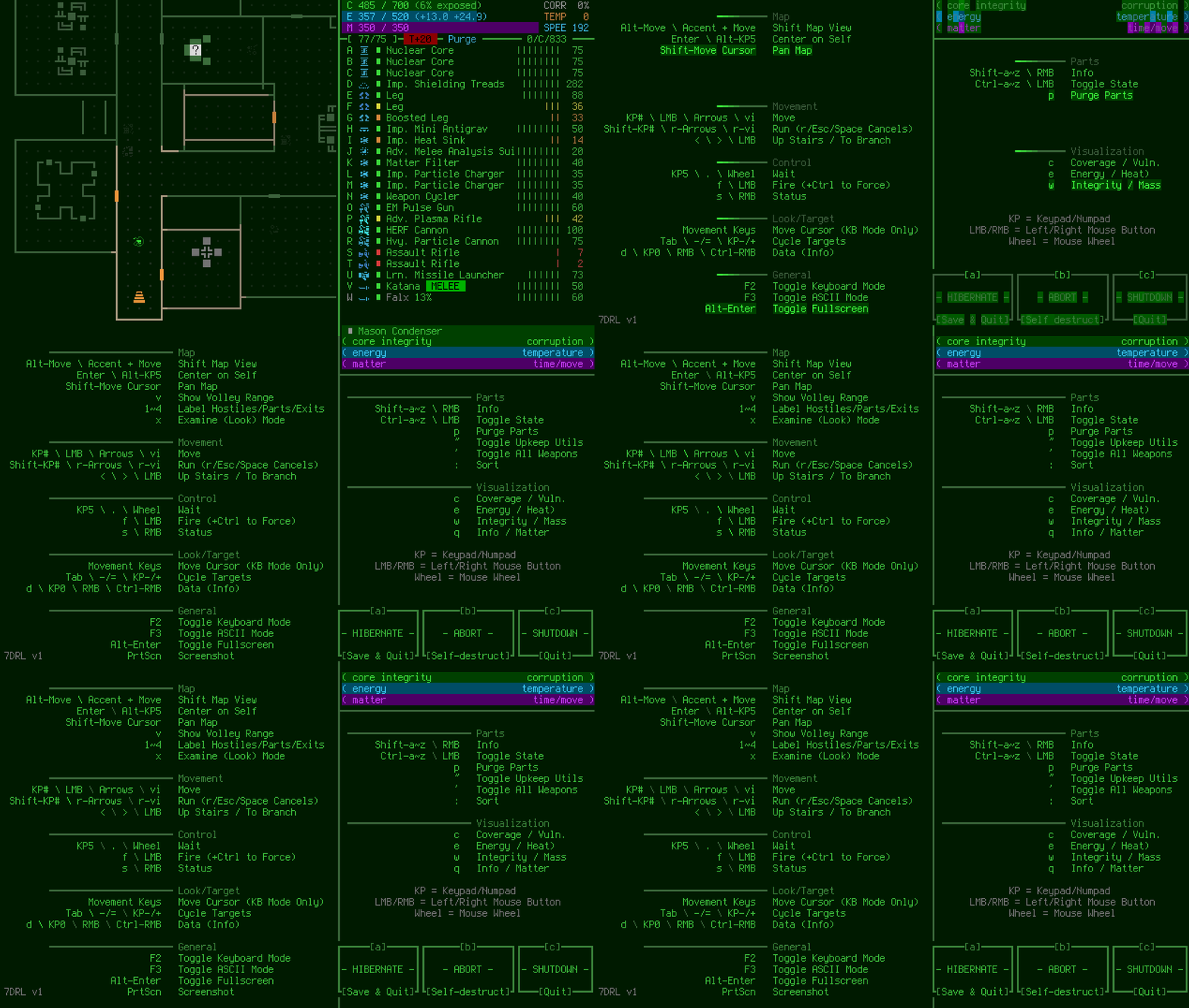
As seen in the earlier layout adjustment diagram, the "Scan" and "Volley" windows (used to get an info summary for the object under the cursor, and attack details, respectively) were both moved out of view, but the info they contain is way too useful to not have it somewhere easily accessible.
While the actual console windows are up above the top of the screen, with all their logic and rendering working normally, I have a one-line strip at the bottom of the parts list that
literally reads the display output of those consoles and copies it down below :P
 The "info strip" at the bottom of the parts list, showing summaries for different objects/states.
I didn't add this particular interface feature right away (notice it wasn't part of the original mockups), but later on after just a little testing realized that sacrificing a potential item slot was worth it!
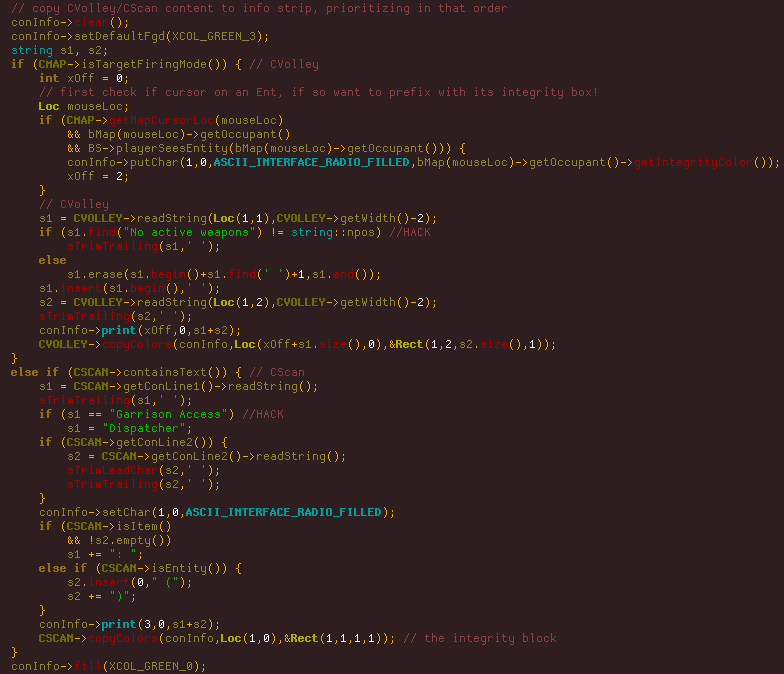 You can see the entirety of the info strip code here, a very messy, quick hack job like everything else done during the week xD. It's copying text from other consoles and somewhat reformatting it as necessary to show in the new area.
After spending an initial day or two executing the UI plan, the next step was to get all the new mechanics working...
First came one of the main new features: part attraction. This wasn't too hard to get running because for a long while now there's been a particular special feature in Cogmind with a similar effect, so I could just adapt that code. A Dijkstra search is performed from the player's location, finding all parts within range (4), and each uses pathfinding code to attempt to reach the player, one move per turn.
Tactical positioning was always important in Cogmind, but with this it becomes even more vital because optimal play must also take into account relevant item locations, including even potential drops from enemies which if too close might fill empty slots with inferior parts!
The part that attaches is randomly chosen from among those adjacent to you, making it even harder to construct a specific build if already wading through items. And parts cannot be removed individually, which would otherwise just invite boring tedium.
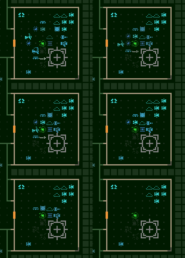 Attracting nearby parts and letting them attach.
With all these items lying around (especially in the form of salvage remaining after a fight), and a lot of them going unused, there needed to be a way to get rid of all the clutter because:
[*]having a cluttered map makes finding the right item problematic
[*]given the attraction mechanics, extra clutter would make it very difficult to ever attract specific desired items
[*]there would basically
always be a variety of extra parts lying around to use, making it easy to avoid having empty slots (i.e. easier to survive in general)
[/list]
Cogmind has Recyclers to take care of this job by carrying salvage off to insert into Recycling Units, but there was a clear decision to use
only combat-related bots in POLYBOT-7. So I again repurposed an existing Cogmind system to handle this need: item self-destruction. In Cogmind this mechanic is only used in special cases, but here it would need to be universal.
All items dropped as salvage from a robot start their own turn counter, and when their timer is up, the item destroys itself. Each leaves behind a little bit of matter, which is both useful (as ammo) and looks cool (you can still see remnants of a battle or group of parts).
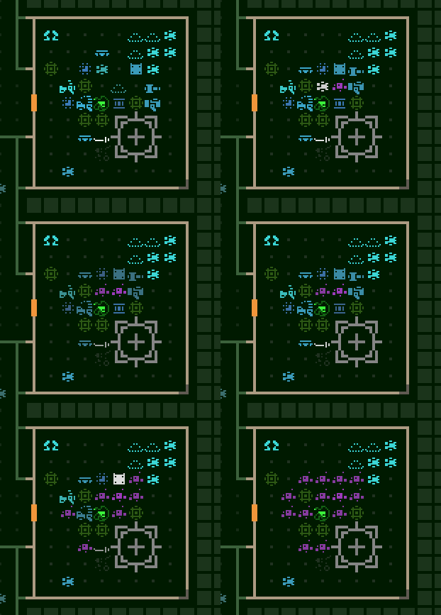 Passing turns to demonstrate parts self-destructing because the player's slots are full.
Obviously there still need to be good parts lying around for the player to find, so those don't have a timer until the player
starts attracting them. And to avoid allowing the player to "drag parts" around a map as backup for too long, any parts that are actively being attracted have their timers count down twice as fast.
As a bit of QoL, items glow a bit once their timer is active, and even faster if their timer is approaching zero. That system can use some improvement but I didn't have much time and it's only of secondary importance anyway.
Another huge strategic change to the gameplay was the removal of slot types. This took the design down the unexplored alternate route considered in 2012, which I think turned out to be really appropriate in combination with POLYBOT-7's other new mechanics, particularly part attraction and mixed propulsion. The resulting highly flexible nature of P7 builds makes runs even more chaotic, and interesting :)
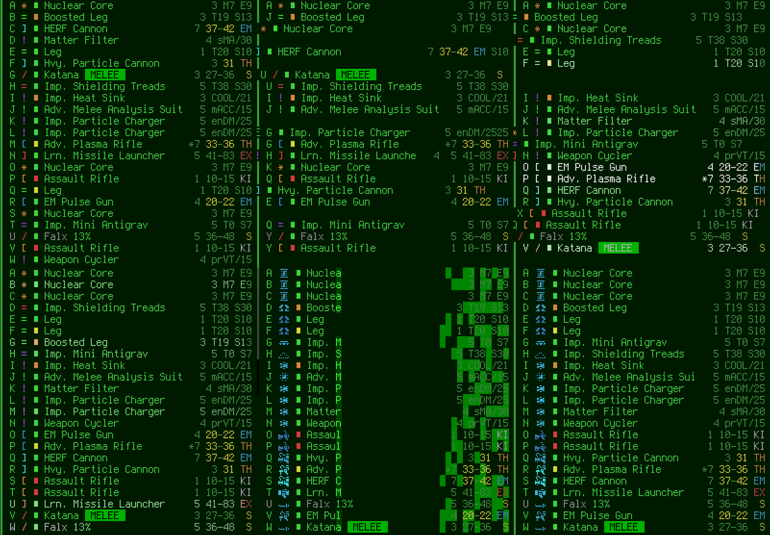 Although there are no type headers anymore, parts are automatically sorted while also showing their ASCII/tile to the left, making it easier to quickly tell how many of a given type are currently available.
Executing this was less painful than I imagined--I mean it's a fundamental assumption in Cogmind that slots belong to a certain type! Internally speaking, slots must still have a type, it's just that input and display restrictions were removed or modified to ignore it. Technically every time the player gains a new slot it's of the "weapon" type, although this is not apparent on the outside because you can fit anything in a weapon slot :P
Another key to simplifying item interaction and build management was allowing multiple forms of propulsion to be mixed (unlike Cogmind where only one form can be active at a time). Simply allowing mixing was easy enough, but the whole propulsion system would become really clunky if the old mechanics were kept but multiple types could be used at the same time. There was just no way around it, the entire propulsion mechanics would have to be redesigned from scratch!
In the design doc this was originally on my list of "stuff that would be nice but I won't have time for," so finding out partway through the week that I really did need a new propulsion system got me worried! To be good, a system like this would likely need to go through testing and multiple iterations, thus clearly not suitable for 7DRL.
Well, what needed to happen needed to happen, so I just buckled down and rushed through the whole thing in one morning. I won't go into the details here, other than to say that reducing the options to only three forms of propulsion really helped. (I had already intended to remove flight because it's no longer appropriate in a combat-focused game, and wheels because they're extraneous and wouldn't be able to serve a niche.)
So hover retains speed without being able to provide much support, legs slow the player down a bit but provide a bit more support, and treads slow the player down even more but provide a lot of support. Conceptually it sounds more or less like Cogmind, although the math in Cogmind doesn't allow for type mixing, and is more complex because it supports other features like overloading (removed for P7) and propulsion that
increases base speed (also nonexistent in P7).
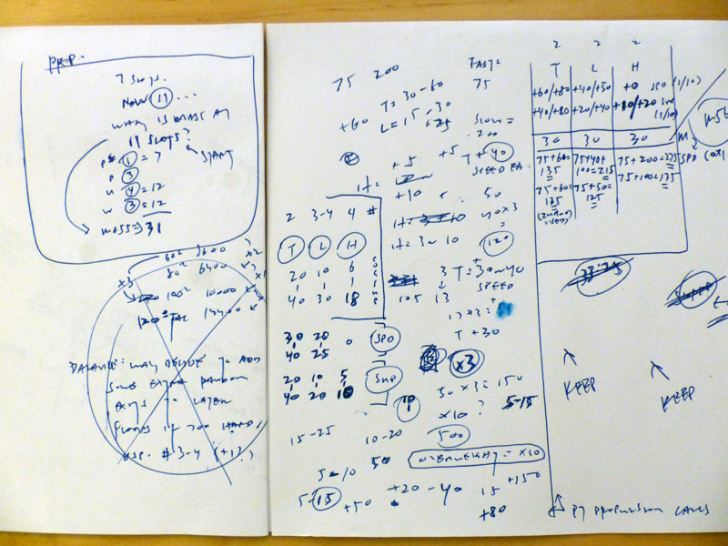 The extent of my propulsion implementation preparations. POLYBOT-7's propulsion mechanics are based entirely on a bit of quick napkin math, rather than proper spreadsheet analysis and testing.
Fortunately I didn't have to make any changes to the system at all--it seemed to pretty much balance out in practice! I didn't even need to change any of the item data templates from which the 54 new propulsion items were derived. Whew!
Kinda like the item clutter issue mentioned before, lack of non-combat bots would have another side effect in POLYBOT-7: there would be no Engineers to rebuild walls. Granted, this isn't as big a problem as clutter, but rampant destruction in a fully destructible world might have some unintended consequences and I wanted to head that off. Plus it'd be cool to see the map being rebuilt, so I did that :P
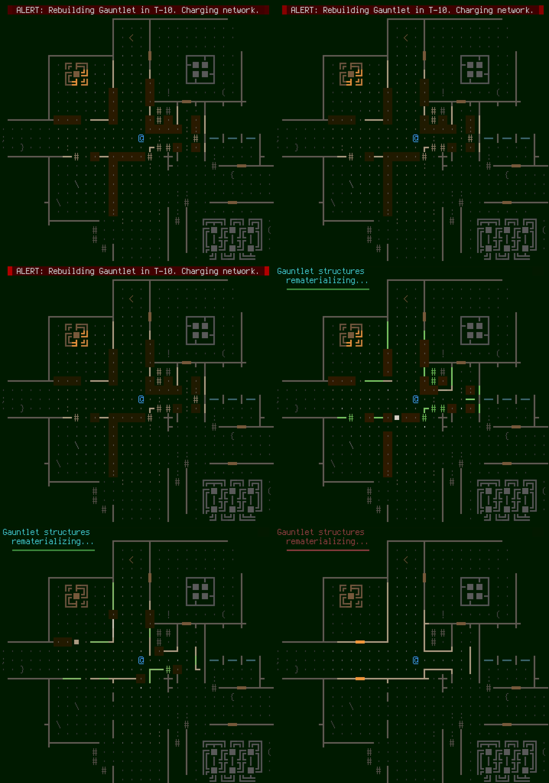 "The Gauntlet" rebuilding its structure.
It would be nice if the animation were faster--it's basically the slowest part of the game (which if you recall I wanted to be fast to play), but I was working quickly and didn't want it to be without sfx (seeing as everything else is audible...), and the only appropriate sfx I had lying around was that long... so I matched the blocking animation length with that. At least it only actually does this if any terrain has been destroyed since the last cycle.
There's also an announcement some turns beforehand in case players might want to react to the fact that it's going to rebuild, for example by repositioning themselves on the other side of a wall to block pursuers/attackers. In hindsight this whole system needs a lot of work :P
AestheticsEarlier I mentioned the importance of finding ways to modify POLYBOT-7's appearance to differentiate it from Cogmind. It plays very differently, so ideally its appearance should be as different as possible, too. We've already got the new UI dimensions, larger pixelated fonts, and color changes, but there are also a few other ways this was achieved.
Oriented line-based walls is an easy and obvious one, and it just so happens that Cogmind still includes code to apply that style (originally from the source code's X@COM days :P). While it was easy to flip that switch, it also hasn't been flipped on in many years so of course it wasn't fully functional... After the bugs were fixed, it also had to take into account oriented
doors, a new feature which ended up requiring some hackish code to quickly implement, and even then I didn't quite get to perfect it (the map rebuilding system doesn't always rebuild doors correctly xD).
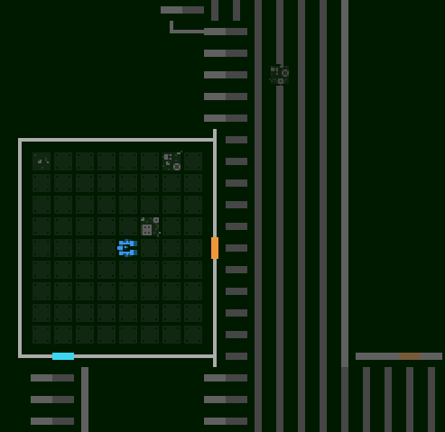 Oops, here's where I finally fixed all the door issues, apparently breaking non-door tiles outside FOV in the process! Typical gamedev... A number of additional complications came from the need to also have the map memory system properly handle orientations. (About the tiles: while I normally work in ASCII I had to check that orientation worked for tiles mode, too, so I still had old Cogmind tiles in at this point.)
As a side-effect of a simple oriented walls implementation, you can get more information than one might expect regarding what's just behind a wall, though in a robotic world this can be explained away with some logic and I left it that way to allow observant players to make inferences about the layout. I did, however, have to spend a while updating the system to ignore connections with hidden passages/doors, which would otherwise render them pointless. By the end of 7DRL there was still at least one anomaly there which would take much longer to properly address, so I didn't do anything about it: hidden corridors connecting at the corner of a room would essentially give themselves away. The orientation system had become somewhat complicated already, and accounting for special cases like that would've required much more work than the simple rules I set out.
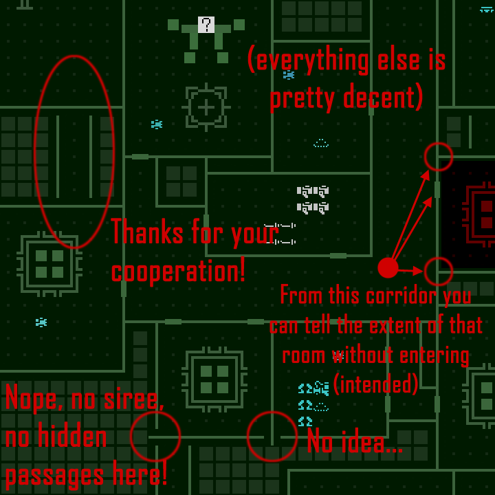 Wall orientation behaviors, for better or worse...
As you can see in the shot above, floors were also changed, using thick dots instead of full-size floor tiles. This helps the foreground tiles stand out even more, not to mention keeps a bit more of the traditional roguelike look (in 2015 Cogmind ended up going with filled floor tiles because it looked kinda different and it's something Kacper wanted to try, which I was okay with since either approach could work anyway).
Kacper agreed to join me on the 7DRL by making a tileset, so we needed a new style for that, too. At first the thought was to give him the full 24x24 base cell size, and at the beginning of the week he put together a few concepts based on that size which were then dropped into the game to see what they looked like.
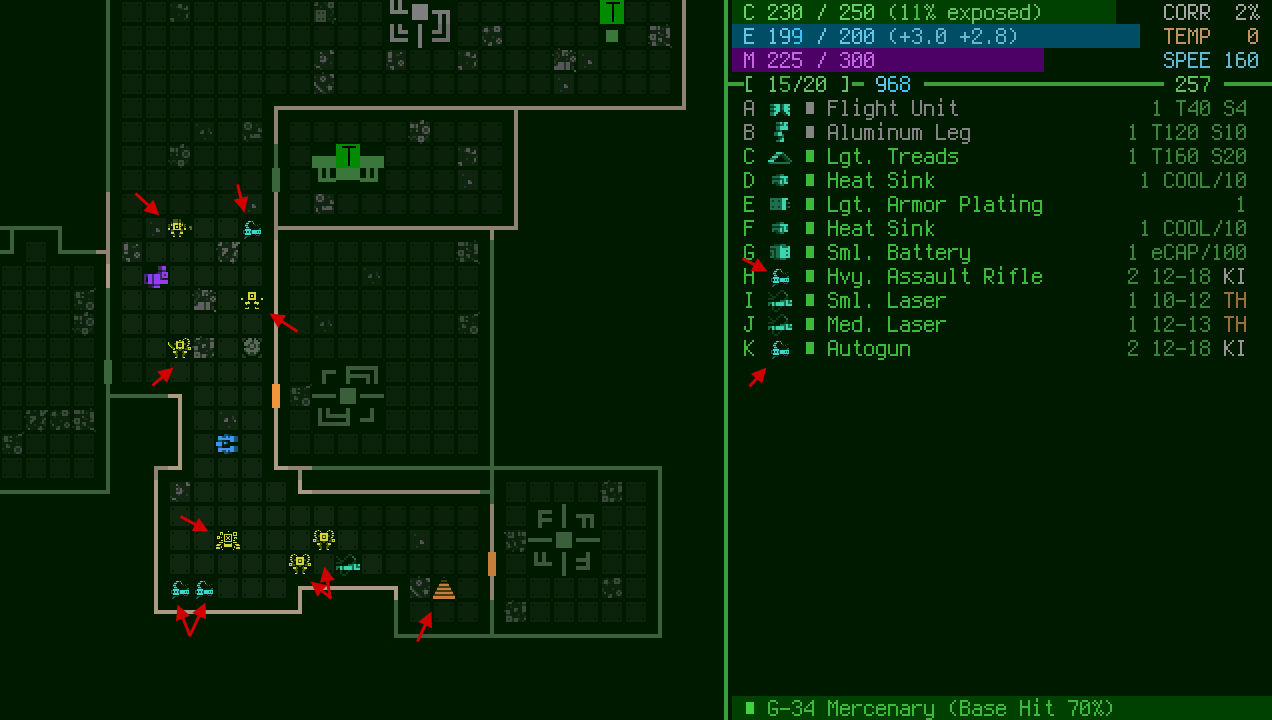 A shot mixing new 24x24 tileset style concepts (marked) with the new text (the rest are old tiles not converted for testing purposes). Also you can see the solid floor cells here, which were later removed.
The main issue was that I created the text by upscaling a 6x12 Terminus font (for its high readability at all required sizes), so its appearance didn't jive with the more fine-pixeled tiles, resulting in an inconsistent look. So we thought it'd be better to go back to using 12x12 tiles and just upscale them to match the text and give the whole interface a large chunky look. I also suggested going with a pure side view, and generally as flat as possible (Kacper had already decided he wanted to work with fewer shades anyway).
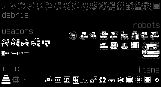 POLYBOT-7 mostly-flat tileset, except for robots which use two shades.
As you can see in the final style demonstrated in the screenshot below, just like ASCII mode the tileset uses oriented doors and walls, and "earth" (filled space behind walls) was converted to a simple square. This both creates a distinctive look as well as kept the tile requirements as low as possible to make sure Kacper could finish (or at least spend more time on what was really important!).
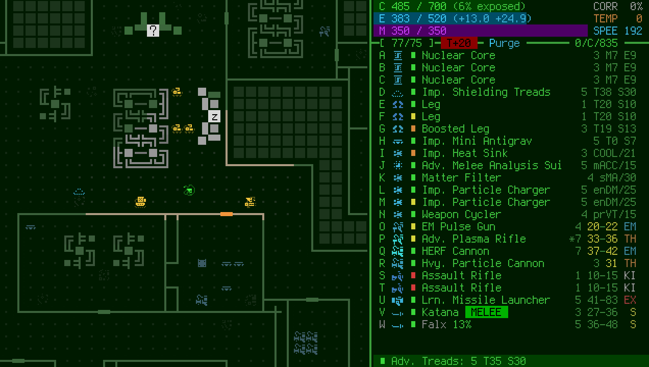
Another pretty big change was the item color scheme. I quickly tested a number of different schemes, anything that seemed like it might work or at least had its own logic to it and was worth investigating. This change in particular wasn't necessarily aimed at differentiating from Cogmind, but more as an experiment in how to simplify the UI.
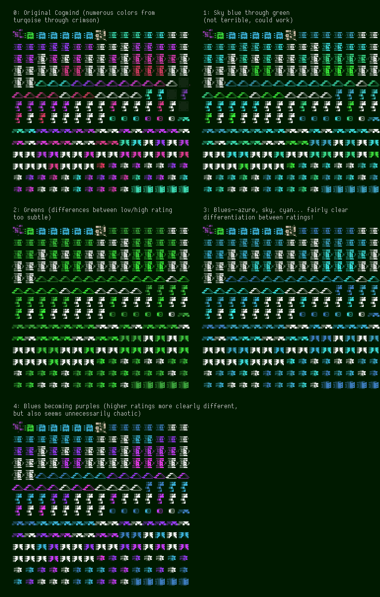 Quick testing of different item color schemes in the sandbox (white are unidentified objects in all cases). #3 won. (click on this to see everything more clearly).
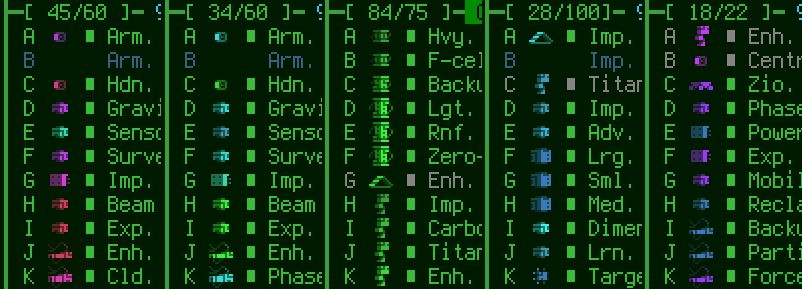 It was equally important to compare what the schemes looked like in the parts list, where their tile would also appear and be used to get at-a-glance info regarding category, type, and approximate rating. (This is a pretty bad comparison because the contents aren't all the same, nor is there a good distribution, but I was in a hurry!)
In the end I liked the simplicity of just blues. They aren't used much in the interface, and go well with "UI green." Even though it's more or less a monochrome scheme, brighter shades of blue could still be used to represent higher rated parts so they naturally stick out more. And blues offer a nice range of associated colors, from azure to sky to cyan.
Note however that the
player was originally also blue, and this could be somewhat confusing when surrounded by items so at the last minute I switched the player to green, since that color wasn't used elsewhere on the map either (now that neutral bots were removed from Cogmind). At the same time I also changed upgrade modules to be green as well, since they're 1) very important compared to everything else on the map and 2) unique to the player character so using the same color for both makes some sense.
Coming next is Part 3: Spending Too Long on Map Generation and Content!

 Author
Topic: POLYBOT-7 (free sci-fi roguelike from the maker of Cogmind) (Read 6072 times)
