Mephansteras: Thank you very much.
Armok: Cheers bro
Buttery_Mess: Wow, thanks. That troll is excellent, btw. It looks like a dwarf caught him moving through the darkness with a flash camera; it makes a cool effect. And the anatomy and foreshortening on his left arm is really nice. If I had one suggestion, it would be to maybe start from the middle of the value range and work outward; it looks like you started on a black background and painted him in with lighter values, which gives it that cool flash-photo sort of effect, but it also means that all your values have to go a long way to get back to light, with the end result that your painting retains a sort of heaviness unless you work hard to expunge it. It's especially evident in the deep black shadows on his face and ear. Starting in the middle grays and working towards lights and darks only gradually makes it much easier to control your values.
Another tip that's really helped me a lot is to make a palette of values and use that when selecting which value to paint. 2 lights, 3 midtones, and 2 darks is a good range, I think. The benefit of this is that you learn to organize and unify your values on your painting instead of just choosing what looks right on a moment-to-moment basis, and this gives you a cohesive value scheme, which is probably the #1 key to realistic painting. (or maybe #2 after good drawing)
Hopefully I'm not irritating you with this unsolicited advice.

Comrade: Ha, thank you. I envy a lot of people's drawing skills, too.
RedWarrior0: I do have a DA account, but there's nothing on it atm. I deleted it all because it caused me excruciating physical pain to look at it. If you want to feel like a bad artist, check out goodbrush.com. Does it for me every time.
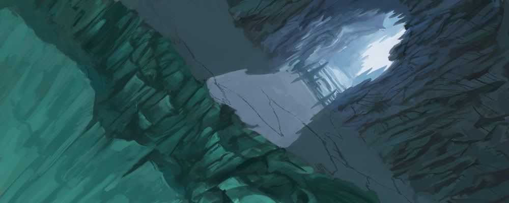
Here is another cave. I was just playing around with perspective on this one, trying to get more of a sense of space in the frame. Dunno if it worked.


 Author
Topic: Fan art competition! *Moving sound* (Read 1517207 times)

