Bay 12 Games Forum

Please login or register.

Login with username, password and session length
Advanced search  
Pages: 1 2 3 [4] 5 6

Author Topic: Starwright (Now known as Cosmoteer) The wonderful game of spaceships and pew pew  (Read 22633 times)

TheBronzePickle

  • Bay Watcher
  • Why am I doing this?
    • View Profile

Guns are operated independently of the control room, even your own ship can still fire if your control room gets taken out. Hopefully the cut off section doesn't have a reactor or factory and so will eventually run out of ammo, though.

Would be kind of hilarious to see a ship with two control rooms that you could cut in half and make two independent ships, though.
Logged
Nothing important here, move along.

H4zardZ1

  • Bay Watcher
  • Mostly Harmless
    • View Profile

Guns are operated independently of the control room, even your own ship can still fire if your control room gets taken out. Hopefully the cut off section doesn't have a reactor or factory and so will eventually run out of ammo, though.

Would be kind of hilarious to see a ship with two control rooms that you could cut in half and make two independent ships, though.
Factories run on plasma batteries. so...
Also, the built-in Star Trek Enterprise ship had 2 control rooms; Try cutting the 'neck'(although it won't be symmetrical, and the 'head' had too few/no thrusts)
oh and cutting a ship in half is bugged af, it confuses the ability to assign target parts and also the cut half keep shooting even without the command room
The assign target parts is controlled by control room; If the control room is taken out, it loses the ability to focus on a single part.
Logged
Quote from: Rock
Quote from: Comrade Qwasich
Stop bullying children
I can't
I have to bully children
Sigtext and other things

LoSboccacc

  • Bay Watcher
  • Σὺν Ἀθηνᾷ καὶ χεῖρα κίνει
    • View Profile

Let me rephrase that: if you cut an enemy ship in half, your ship targeting gets fucked up
Logged

H4zardZ1

  • Bay Watcher
  • Mostly Harmless
    • View Profile

Let me rephrase that: if you cut an enemy ship in half, your ship targeting gets fucked up
It is caused because the game chooses at a random(or which part of the ship had a control room) which will be the 'main' half and 'generated' half; If you click on the 'main' half, you will see the entire ship in the repair screen, while the 'generated' half had only it's parts after split.

The 'main' half will be targeted.
« Last Edit: July 04, 2016, 03:02:24 am by H4zardZ1 »
Logged
Quote from: Rock
Quote from: Comrade Qwasich
Stop bullying children
I can't
I have to bully children
Sigtext and other things

LoSboccacc

  • Bay Watcher
  • Σὺν Ἀθηνᾷ καὶ χεῖρα κίνει
    • View Profile

exactly the problem I'm talking about. sometimes the second half has way more weapons and to reduce damage I try to prioritize large cannons because most of my shielding is front. that's where the main/split system fails


edit: got to the point where I can fight two enterprises
Spoiler: 1.2m ship (click to show/hide)

can one add more enemy ship design in the standard game?


edit: looking at the data files extending bounty mode is annoying because one has to code enemies bounties and tiers at hand. it'd be much better to have that mode work on parameters, like pick ships that are between 80 and 100% of player value, and give 10% as reward. that would make extending the mode as easy as dropping .ship.png in the bounty folder


edit: another random suggestion: corridor walking speed should be faster than rooms'
« Last Edit: July 04, 2016, 06:41:05 am by LoSboccacc »
Logged

H4zardZ1

  • Bay Watcher
  • Mostly Harmless
    • View Profile

exactly the problem I'm talking about. sometimes the second half has way more weapons and to reduce damage I try to prioritize large cannons because most of my shielding is front. that's where the main/split system fails


edit: got to the point where I can fight two enterprises
Spoiler: 1.2m ship (click to show/hide)

can one add more enemy ship design in the standard game?


edit: looking at the data files extending bounty mode is annoying because one has to code enemies bounties and tiers at hand. it'd be much better to have that mode work on parameters, like pick ships that are between 80 and 100% of player value, and give 10% as reward. that would make extending the mode as easy as dropping .ship.png in the bounty folder


edit: another random suggestion: corridor walking speed should be faster than rooms'
Flank or one-side attack?

Also, corridor walking speed is already faster than rooms.
Logged
Quote from: Rock
Quote from: Comrade Qwasich
Stop bullying children
I can't
I have to bully children
Sigtext and other things

LoSboccacc

  • Bay Watcher
  • Σὺν Ἀθηνᾷ καὶ χεῖρα κίνει
    • View Profile

managed to reproduce the targeting issue, if you click on a component to target on the secondary piece it gets ignored, you have to disengage first, target the secondary and then target the component you need to smash

here's an example of targeted component being ignored https://gfycat.com/EnergeticGrandBlueandgoldmackaw
Logged

H4zardZ1

  • Bay Watcher
  • Mostly Harmless
    • View Profile

managed to reproduce the targeting issue, if you click on a component to target on the secondary piece it gets ignored, you have to disengage first, target the secondary and then target the component you need to smash

here's an example of targeted component being ignored https://gfycat.com/EnergeticGrandBlueandgoldmackaw
The core of the bug seems to be the fact that it is targeting to both halves.
« Last Edit: July 05, 2016, 12:02:45 am by H4zardZ1 »
Logged
Quote from: Rock
Quote from: Comrade Qwasich
Stop bullying children
I can't
I have to bully children
Sigtext and other things

Hanzoku

  • Bay Watcher
    • View Profile

I'll drop this one here - so far, of all my personal ship designs, this one has stood out for being (relatively) inexpensive, and stupidly tanky from the front. You can ruin its day with multiple enemies if one gets into its rear arc, but it can generally wipe out anything coming at it from the front, though some manual targeting to strip the other ship of its main weapons might be needed in some cases.

In the bounty game, wolf-packing an enemy ship with two or three of these ends up in a blood bath.

Logged

LoSboccacc

  • Bay Watcher
  • Σὺν Ἀθηνᾷ καὶ χεῖρα κίνει
    • View Profile

there were a couple releases fixing stuff for older graphics card owners, but still not an easy way to get ships in game as enemies :(
Logged

waltd

  • Bay Watcher
    • View Profile

It's been a while since I've posted here about Cosmoteer, so this is going to be a longish post as I catch up on some of the new features since last time...

Oh, but before I begin, I also want to mention that Cosmoteer now has an Official Community Forum!

Copy & Paste

I'm generally very happy with how intuitive ship design has become. When I watch new players play the game, rarely do they have much trouble figuring out how to modify and expand their ship, thanks to many iterations and improvements to the user interface

But many players, myself included, found the process of designing larger ships (especially in Creative Mode) with repeated sections (possibly rotated and/or flipped) to be very tedious, since every part on the ship had to be added individually, even if a whole section of the ship was merely a copy of another section.

Let's say that you want to build a symmetrical ship with a center fuselage and mirrored wings on each side. So you start by designing the center fuselage and one of the wings. Prior to this release, you'd have to manually design the other wing as well, being very careful to exactly mirror the original wing. But now, you can use the new "copy and paste" tool, first selecting all the parts on the left wing...
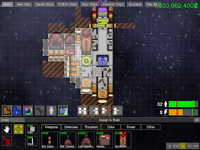


... then clicking the "copy" button (ctrl-c works, too), followed by the "paste" (ctrl-v) button, which will load the copied parts as blueprints on your mouse cursor. Once in paste mode, you can choose to rotate and/or flip the blueprints before pasting them onto your ship...
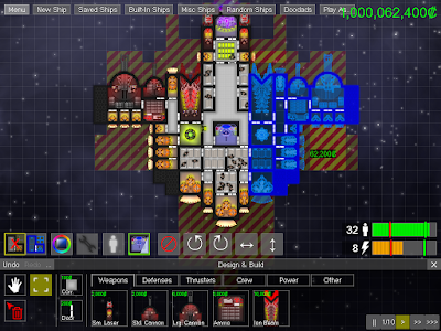


... and then you simply click to add those parts to your ship, giving us the final result:
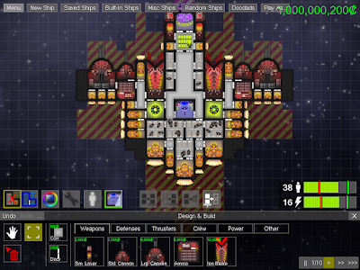


I'm very hopeful that this will make designing large, interesting ships much easier. Indeed, I can already find myself being more creative in my own ship designs, knowing that I won't have to duplicate any designs that I want to repeat elsewhere. (It's also worth noting that the copy & paste tool can be used to copy between ships as well.)

While this may seem like a pretty basic feature, it was actually a very serious technical undertaking to get this working. Ever since I (re)introduced the now-default "live design" mode, I've had code logic to determine whether adding a single part to a particular location was legal, but there was no code to determine whether adding multiple parts in arbitrary locations was legal, which is a far harder problem to solve, because some of those new parts may only be legal because of other parts that are also being added or may be illegal because of other added parts.

Part Micromanagement

I added the ability to micromanage individual parts, letting you give them individual targets, turn them off or back on, or tell them to hold fire.

To control the individual parts on your ship, first select your ship if it isn't already selected. Then, click on a specific part or drag a box around the parts you want to select:
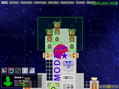
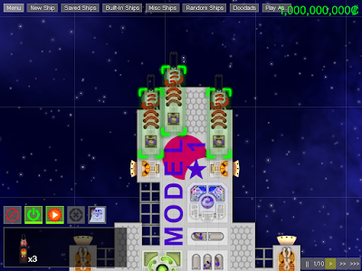


The user interface in the bottom-left will change to give you some options pertaining to the parts you have selected. Most parts that consume power or ammo can be turned off, causing their crew to go perform any other jobs that need doing. And weapons can be told to "hold fire", which will prevent them from shooting unless you've given them a specific target, which you can do by right-clicking on a part of an enemy ship.

Additionally, I also added "control groups" like those found in most conventional RTS games. To put the selected ships into a control group, press Ctrl-F1 through Ctrl-F8, and then press F1 through F8 to select the ships in that control group. To put the selected parts into a control group, press Ctrl-0 through Ctrl-9, and then press 0 through 9 to select the parts (of the currently-selected ships) in that control group.

Customizable Controls

I love PC games, and one of the reasons that I love PC games is because, at their best, they're very customizable. But it really bothers me when a PC game (frequently ports of console games) lack what IMHO are pretty standard PC gaming features; things like borderless window mode, support for computers with multiple monitors, support for high-resolution displays, triple-buffering, and good alt-tab handling, all of which Cosmoteer does well. But there's one standard PC gaming feature that Cosmoteer hasn't had (which I've been a bit ashamed about, as an avid PC gamer), and that is customize keyboard controls.

Until now!

Cosmoteer now lets you customize pretty much every control in the game. Want to change the hotkey for opening build mode to Shift-B? You can do that! Want to set Q as a shortcut to select the Crew's Quarters in build mode? You can do that! Want to make shift-tilde-apostrophe act as a left mouse click? Well, you're insane, but you can do that! There are currently 134 different actions that can be assigned to keyboard keys or mouse buttons, and each action can have two different key/mouse button combinations set to it.
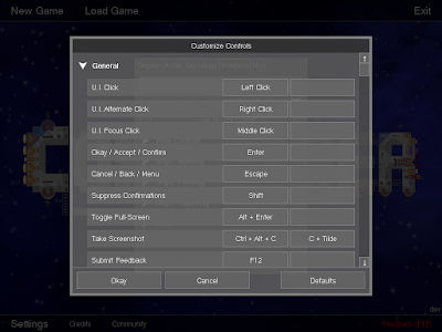


Customizable controls are great for those of us who really like to personalize our gaming experiences, but they're also really important for making the game accessible to people who have physical disabilities; customizable controls allow them to tailor the game's controls to their own abilities so that they can still play and enjoy the game, even if the default setup doesn't work for them.

Oh, and also, by popular demand, WASD is now supported by default (in addition to the arrow keys) as a way of panning the game view. (And some existing shortcut keys got moved as a result.)

New Main Menu Design & Layout

The Main Menu has received a bit of an overhaul:
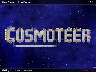


Now, the most-commonly-used options (New Game, Load Game, and Exit) are at the top of the screen, while lesser-used options are at the bottom. The primary purpose of this change is to create more room for options to be added as the game expands. I've already used this newfound room to add a "Community" button, which takes you directly to the online forum. Eventually I may add more options, such as multiplayer and mod settings.

Multi-Language Technology

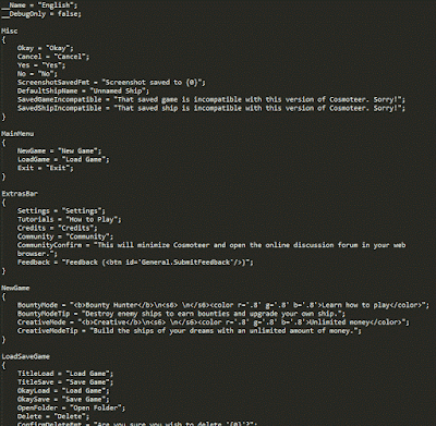
Until this release, most of the text displayed by the game was written directly into the game's source code. This worked fine while the game was in the prototype stage, but it made it impossible to translate ("localize") the game into other languages. So I spent a couple days building a system to allow all of the game's text to be loaded from an external file, which can then be translated into other languages. While currently the only included language is English, it's now possible to translate the "en.txt" file into other languages and simply drop them into the "Data/Strings" directory. The game will automatically detect the additional languages and allow the player to switch between them in the Settings menu.

Here's an example of what the "en.txt" file looks like:
Logged

waltd

  • Bay Watcher
    • View Profile

Quote
managed to reproduce the targeting issue, if you click on a component to target on the secondary piece it gets ignored, you have to disengage first, target the secondary and then target the component you need to smash

here's an example of targeted component being ignored https://gfycat.com/EnergeticGrandBlueandgoldmackaw

This isn't really a bug; more of a weakness with how I've designed the user interface for targeting ships to work. I'll think about how I can improve it. Anyway, the latest release should improve how your ships re-target when the current target splits in two.

Quote
looking at the data files extending bounty mode is annoying because one has to code enemies bounties and tiers at hand. it'd be much better to have that mode work on parameters, like pick ships that are between 80 and 100% of player value, and give 10% as reward. that would make extending the mode as easy as dropping .ship.png in the bounty folder

This would be nice, but would require every single ship in that folder to be automatically loaded, which once there are hundreds of ships would be quite the performance hit. I have my own tool that scans that folder and auto-generates the bounty ships list. I'll think about making that tool public.

Quote
also blueprint copypaste wouldn't be bad, these thing get quite big

This is now supported (see above post).

Quote
however I'd wish for ship position to be relative to enemy orientation, so that if you drag left of an enemy that has forward facing cannon your ship keeps trying to stay on it's side

This is now also supported, though your ship will need to be very maneuverable for it to work well.
Logged

H4zardZ1

  • Bay Watcher
  • Mostly Harmless
    • View Profile

Copycat of my thread there. Looking for commentary(lol).
Anyone need copy modules related to anything?
Logged
Quote from: Rock
Quote from: Comrade Qwasich
Stop bullying children
I can't
I have to bully children
Sigtext and other things

waltd

  • Bay Watcher
    • View Profile

Some new major features I've gotten done in the past few months:

Bounty Hunter 2.0

For about the past year, the standard mode of play, "Bounty Hunter", has been pretty simplistic. You, the player, start with a single ship and destroy enemy ships in the immediate vicinity to earn money which can then be used to upgrade your own ship or purchase additional ships. As you destroy enemy ships, additional enemies spawn nearby, and as your own ship or fleet increases in power, the larger, more powerful enemies swill spawn as well.

This simple kill-reward-upgrade-repeat loop has been fine for testing and iterating on the core ship construction and combat gameplay mechanics, but it honestly wasn't very engaging for the player. Killing an endless stream of ships over-and-over again in the same location with little choice gets repetitive really fast.

Bounty Hunter 2.0, while not solving all of the issues of Bounty Hunter 1.0, seeks to create a much stronger foundation upon which further improvements can be built. Instead of playing in a single location with an unlimited supply of respawning enemies, the game is now played across a large galactic map:


Each location in the galaxy map (the green icons) has only a handful of enemies, and they don't respawn as you destroy them. Instead, once the player destroys all of the enemies in a location, they must move on to another location. Each location has a small colored "shield" icon that indicates the strength of enemies present there:


In Bounty Hunter 1.0, the game itself determined the difficulty of enemies that the player would face, which meant that for many players the enemies were either too easy or too difficult. This new system gives the player a degree of choice in what strengths of enemies they will face, and lets the player pace their own difficulty curve.

More importantly, this new galaxy map now provides a strong foundation on which more gameplay can be added. In the future, as the player explores the galaxy, they will encounter space stations to trade with, pirate bases, asteroids to mine, vessels in distress, and more. These features will be added to the game over time as they are developed.

The galaxy map itself is procedurally generated, usually with 4-6 solar systems full of planets and moons. Each location is "attached" to a nearby planet or moon, which then appears in the background during gameplay to give visual variety and a better sense of location. The planets, moons, and stars themselves are procedurally generated using Perlin Noise. Blue, red, and yellow nebulas also abound in the galaxies, which determine the color of the background during gameplay.

F.T.L. Drives

In order to move from location to location within the galaxy, the player must construct at least one F.T.L. (Faster Than Light) Drive on their ship. Once constructed, the FTL drive allows the player to perform jumps to other locations.


Jumping, however, is not free. F.T.L. Drives use a new kind of "fuel" resource. Like credits, fuel is earned from destroying enemy ships, and then it is spent to perform an F.T.L. jump. The amount of fuel spent is determined by the distance of the jump, the size of the ship(s) making the jump, and the efficiency of the ship's F.T.L. Drives.

Efficiency is a new concept in Cosmoteer that determines how much fuel is used when an F.T.L. jump is performed, and its gameplay purpose is to make the number and placement of F.T.L. Drives on a ship a strategically important decision. When adding an F.T.L. drive to a ship, the game displays a green/yellow/red overlay indicating which areas of the ship are close to an F.T.L. drive (green) compared to which areas are far from one (red).


The farther (more red) areas greatly increase the amount of fuel need to perform an F.T.L. jump. And so to minimize the amount of fuel used, the player will want to place multiple F.T.L. drives around their ship in a variety of locations, making as much of the ship green as possible.

If the player ever runs out of F.T.L. fuel, they can purchase additional fuel for credits, but doing so is extremely expensive, and so it is almost always preferable to improve the efficiency of one's ship.

Because the amount of F.T.L. fuel earned from destroying enemies depends on the size of the enemy ship, as your own ship(s) grow in size, it becomes much less cost-effective to battle enemies that are smaller and weaker than yourself. (If you spend fuel to jump a very large ship to a location with small enemies, it is unlikely that you will earn enough fuel to recoup the fuel that you spent getting there.) My intent when balancing fuel costs vs rewards is that a ship with 75+% efficiency that fights ships its own size will generally break even on fuel.

User Interface Refresh

The user interface has received a complete visual overhaul -- gone are the boring gray boxes, replaced with a spacey blue-and-green theme complete with sound effects and animations.

Before:


After:


Aside from the visual changes, there are also some small-but-important changes to the actual functionality of the user interface.

First, the player can no longer (by default, although this can be reverted in the settings) simply click on or drag a box around specific parts to select them -- the player must now hold the Ctrl key while clicking. This is because my playtesting showed that many new players would accidentally click on parts of their ship and then be unable to give their ship orders, which was confusing and frustrating for them. By requiring the Ctrl key be held, it's now almost impossible to accidentally select parts without meaning to.

Second, because you can't upgrade your ship until you repair it, the game now only shows either the repair button or the build button, never both at the same time. (When your ship needs repairs, the repair button is shown in the place of the build button.) In some playtests, players got confused about why they couldn't press the build button, and so this change should hopefully make that more obvious.

Lastly, turning on "blueprints mode" is no longer a strange toggle that appears next to the build button after pressing it -- it is now a simple checkbox item in the '...' menu, and the game now remembers your preference.
Logged

NullForceOmega

  • Bay Watcher
  • But, really, it's divine. Divinely tiresome.
    • View Profile

Very nice, bounty mode was getting very stale, this looks like much more fun.
Logged
Grey morality is for people who wish to avoid retribution for misdeeds.

NullForceOmega is an immortal neanderthal who has been an amnesiac for the past 5000 years.
Pages: 1 2 3 [4] 5 6