A UI overhaul would have to be done with every update. And I don't think any of DF's complexity is pointless.
No, a UI overhaul would need to be done once. A standard format for information and keystrokes would be adopted. And then as additional UI elements are added, they are made to fit that format. I'm in the industry (the industrial side of the industry to boot) and even punching boolean values into a ruggedized circuit board trying to fool it into thinking an imaginary 5000kw diesel engine is running, I have a better UI than this. When that UI begins to drift from standards, we file a report and it gets fixed. Here, there are no standards, just habitual patterns, and it creates pointless complexity. Not depth, complexity.
Pointless complexity example; WASD UHJK Left Right Up Down 8462 /*-+ all depending on the particular screen you're on. There is no unified schema to it. Why are these menus not mouse-enabled? With full mouse integration, the game's learning curve could be stripped to a half-dozen keyboard commands to bring up the menus you click on. Mousewheel Z-level changes. Multi-tile constructions designated by dragging a box. Ordering constructions by painting them with the mouse instead of building each cell individually.
There are so many ways to reduce complexity, which will allow more players to experience the game. Currently there is a whole genre of DF-knockoffs whose only merit is mouse support and integrated isometric graphics. "Towns" sold 200,000 units at $15 each. That's three million dollars for
unfinished shit with a halfway decent UI. Adding another feature arc that brings 5% more of the grand vision to the current user base should come after a UI pass that grows the user base 5000%. And doing it now is plainly easier than doing it later.
Stagnant, really? Do you think I've not spent five minutes looking at the UI? And yes, I would like to see all of a dwarf's most important information condensed onto one screen from which I can navigate to detailed screens.
For example,
Avron Zeronozada
Male, 126
Married to Obakhekh Otoderozera, 2 children
Fishery Worker, Proficient Fisherdwarf
Civilian, Striker
Dreams of creating a great work of art.
Owned Objects: 10
No rooms.
"I'm doing alright".
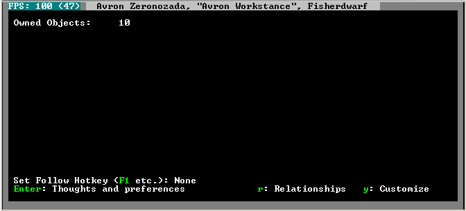
Instantly I know he needs a job change to an art profession, should be assigned a larger bedroom because of his family size, and all of this replaces the main profile page, which presently, following 'most logical format possible', is...

Your eyes slide off this black space -every time- you are on your way to another screen in the profile. How many times have you selected a dwarf to see how many rooms he's assigned? How many times was this page just a pop-up box to be dismissed on your way to the personality profile?
Which, most logically, should be shown here?We can either all collectively lie to ourselves and pretend learning the UI is part of DF's difficulty curve, or we can realize the game's difficulty curve and the UI's difficulty curve are not the same thing. Having a hard UI does not make a hard game, it just makes for hard play.

 Author
Topic: Forget new features for a while... Let's work on optomization (Read 7530 times)

