I have been working on a card game called Dancing Robots for a while. I have gotten help on this forum in the past about balancing and playtesting it.
Now I run into art issues.
Here is a sample of what I have so far:
I paid my brother in law to make the actual art for all the parts cards (the stuff in the middle of the image) and I composed the card itself (the words, background, shadow, and icons).
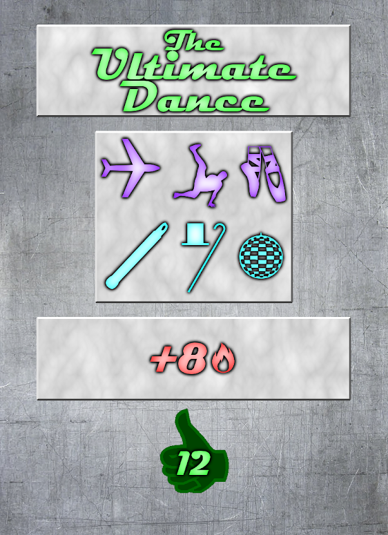
It looks decent to me (if anyone has any helpful pointers I would happily listen to them), but I am now starting to make the dance move cards. They are a little harder to make because each card is different (therefore there are way more of them). I feel like to fit everything in I need to have no art work in the center (which is fine because I have only paid Dave for the artwork for the parts anyway), but I don't like how they are laid out. Here are some examples of things I have been fooling around with:


Parts of cards for reference:
the top box is the title
the second box is the move types
the third box is the rules
the symbol at the bottom is the awesomeness(score) of the move
These cards show all of the broad categories of moves in the game, so I am sure that if the layout that I chose can accommodate all of these cards it can accommodate all of the dance moves in the game.
If anyone is interested in coming up with ideas of how to better arrange the cards so that everything fits on, but it doesn't look so uneven I would love to hear them.
Also, if a card doesn't have rules, do you think that I should still put the rule box on it?
For those who are interested in learning more about the game so that they can make better contributions:
here are the rules.
Here is the website (online play against AI or human opponents)
here is the album of 'completed' parts (not all the art is finalized, and I am open to suggestions)
here is the album of moves that I have started working on.

 Author
Topic: [WIP] Dancing Robots artwork (Read 1151 times)
