Ok I know I know the UI is not a priority, nor is the game "that hard to learn" or whatever. I actually agree with all of that. HOWEVER I still think part of DF's bad rap in people learning the game has a lot to do with really really simple UI stuff. Specifically I'm talking about the main menu. The problem with the main menu is not the wealth of options, or even having it expose the complexity of the game. I think a big part of the problem is just simple issues with layout and naming. Problems that should be very easy to remedy very quickly.
First what we are dealing with:
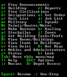
It's a mess! The most important menu options for new players (designations, stockpiles, zones) are spread all around the menu and most of the menu has no logical progression in how it reads. So new players see this and just give up on trying to parse it effectively. So anytime they forget a command they just get frustrated. I think we can do a lot better:

Here's a mock-up I've made. I've organized the menu in a top down fashion. At the top are all of your commands that interact with the world in some way (building, designations, stockpiles, etc.) that gives way into reports and listings which then gives into all of the view commands and finally the help/menu/movie commands.
NOTE: I forgot the Hot Keys menu option which should appear above TAB or to the right of View Units
I've also made a few changes:
Building should really be buildings (or build). It's the only singular noun in the whole list.
I did move the right column in a bit mostly because I could, though you wouldn't need to.
Some items have had their menu name shortened because they're unnecessary. Depot is the only menu option at all referring to Depot so having it say just Depot instead of Depot Access will confuse no one. Same with Move this menu/map which I changed to View Map.
I grouped line wide elements together as much as possible (as in lines that take the whole width). This way the UI reads cleaner and the columns are more distinct making the menu easier to parse visually.
I would probably also change Desginations text to something like Mining & Designations. ONe of the chief complaints about DF is "I couldn't even figure out how to mine". Having it easily identifiable will help to color player's first game perceptions.
Uh well that's it. I just wanted to show that there's some really really easy things that could be done that would probably help to improve the new player experience for Dwarf Fortress at a minimal amount of effort and no gameplay changes.


 Author
Topic: Low hanging UI Fruit (Main Menu) (Read 2659 times)
Author
Topic: Low hanging UI Fruit (Main Menu) (Read 2659 times)