I have no idea if this is the right place to post something like this, but the Bay12forums has been good to me so far so here I am, looking for some advice.
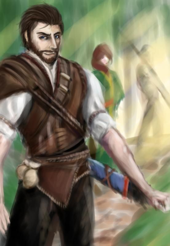
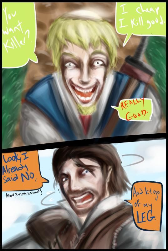
I've been planning this thing for about a few months now. It's a semi-serious comic/graphic novel set in a Medieval Fantasy world of which I've already planned out the characters, setting and most of the story. I just recently finished the first page, but I'm still torn about the style I should do it in. I settled on two styles, and I've taken the liberty of repainting the first page in these two styles as well as providing a concept piece to go along with it just to show how the style's supposed to look like.
And I'm counting on you fine gentlemen to help me break this impasse.
-----
 Concept of Duke Lionell, Protagonist.
 Page 1
This is the 'high-risk, high-reward style', as I like to call it. If I do it right, it looks wonderful. Though on bad days, it looks like roadkill left over in the heat (as evidenced by Mr Uncanny Valley in the top frame of Fig 2). Other than that, it gives me a degree of freedom and experimentation due to the lack of lineart borders. I'm not too familiar with this style though, but it's something I'm planning on phasing to sooner or later. The timing of each painting is also sporadic in this style.
-----
 Lisette, one of the characters.
 Page 1 in Cell Shaded
Ye olde faithful. Simple and easy on the eyes. The lineart takes a bit of doing, but after that it's just a matter of slapping on colors. The very cartoonish look is a bit off putting for me though, but that may just be due to a color choice and design rather than the style itself.
-----
So what do you guys think? One or two? Or should I do an amalgamation of both? (like painterly for background and cell shadey for characters.) Any tips and constructive criticism are welcome as well. Once I choose a style, I'll set to painting the images immediately, since I already have the next dozen or so pages drafted. Thank you in advance


 Author
Topic: Help an indecisive artist choose an art style for his comic/graphic novel thing! (Read 1051 times)
